Grounded in Tradition. Designed for Tomorrow.
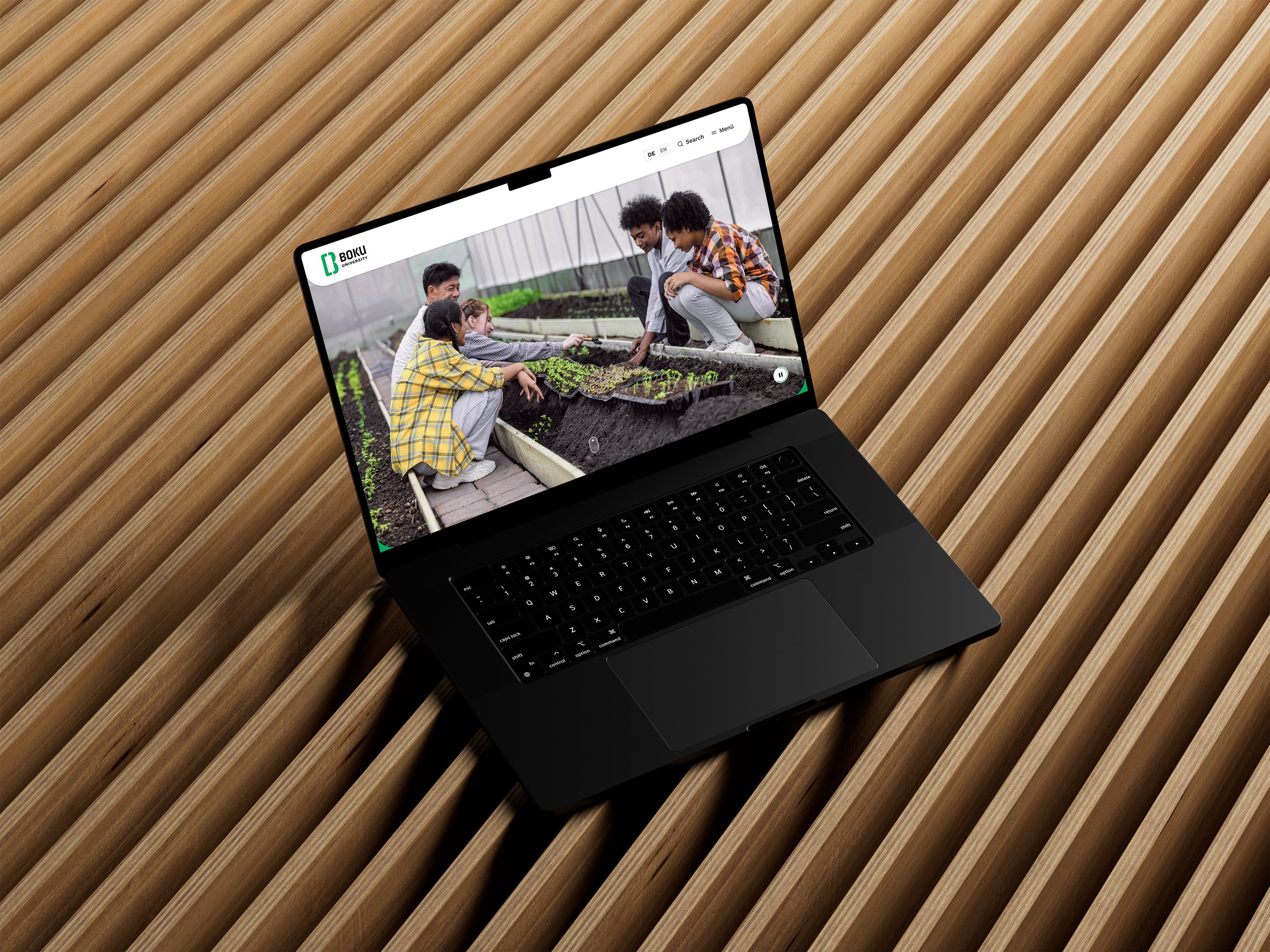
A full website relaunch for BOKU — giving 150 years of expertise a digital presence to finally look as forward-thinking as it actually is.
2025 ✳︎ 9 months
year ✳︎ duration
Public
industry
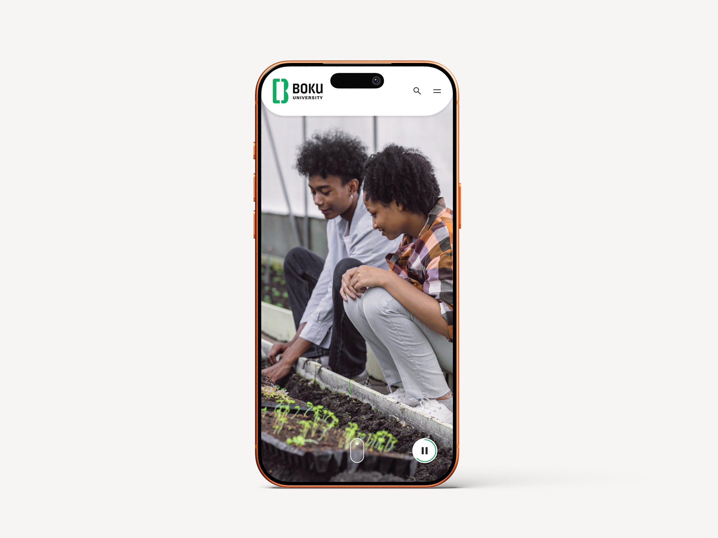
Responsive Website
platform
UX Consultant ✳︎ UI Designer
project role
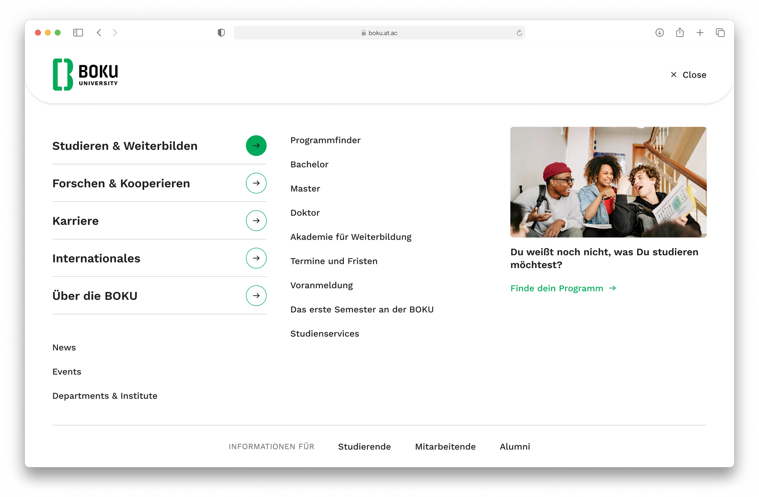
Steps along the way
From early research to dev handoff, here's the process laid bare.
00 The setup
-
BOKU's website no longer reflected who they were — a modern, sustainability-driven university with 150 years of expertise. Time for a relaunch.
-
Reposition BOKU's digital identity: from dated and niche to modern, relevant, and future-facing — for prospective students, researchers, and the general public alike.
-
User Interviews · Stakeholder Workshops & Documentation · Wireframes · Prototypes · Information Architecture · Design System · User Testing · Prototypes · Mockups · Handover to development
Straight from the Source
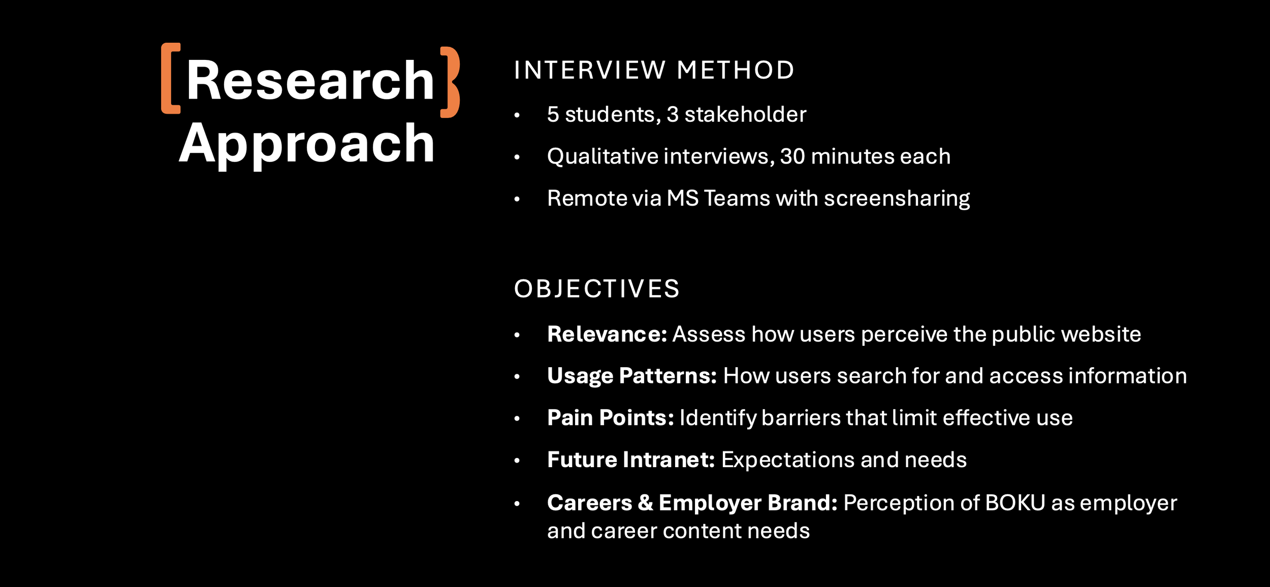
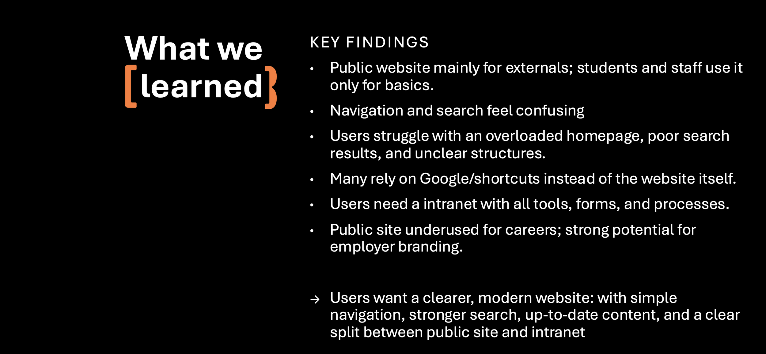
Before designing anything, we went directly to the people who use the site most. 8 interviews across bachelor and master students, and university employees — gave us a clear picture of where the website was falling short and what each audience actually needed from it. The insights confirmed our assumptions and gave us the foundation to move forward with confidence.
More voices than expected
Seven workshops revealed what no brief could fully capture — a university of remarkable complexity & legacy, with audiences, needs, and stories that all deserved a place on the website.
Me and the Project Lead facilitated 7 of 9 workshops — each one bringing together a different group of internal stakeholders to align on content, priorities, and audience needs. The sessions cut across nearly every corner of the university.
WS03 — Employee Content
Collecting ideas for attracting future employees and defining guidelines for a digital space that supports day-to-day work.
WS04 — Student Content & International Students
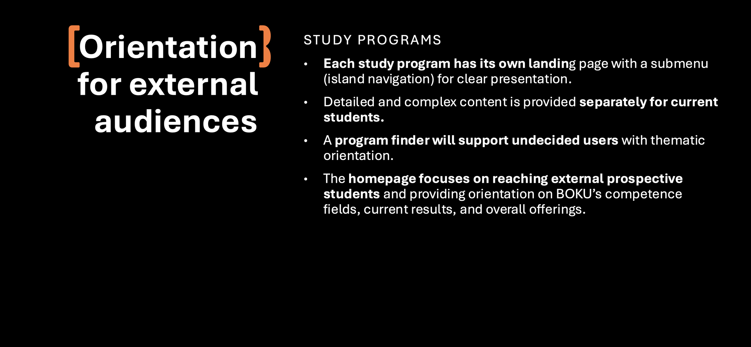
Defining what content students — local and international — need and how to make it findable for all users.
WS05 — Study Programs & Services
Deciding how to structure information for prospective students so they can efficiently find what they need.
WS08 — News & Events
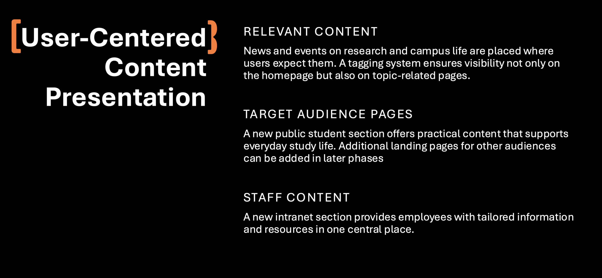
Deciding how the right user finds and engages with relevant news and events on the BOKU website.
WS06 — Research Content
Aligning on who BOKU wants to reach in the research space and what content supports that goal.
WS09 — Intranet
Setting a long-term vision for what the BOKU intranet should look like and establishing a starting point for the concept.
WS07 — Departments & Institutes
Defining target audiences for the department and institute pages and deciding how to present complex structures efficiently.
What the Rooms Told Us
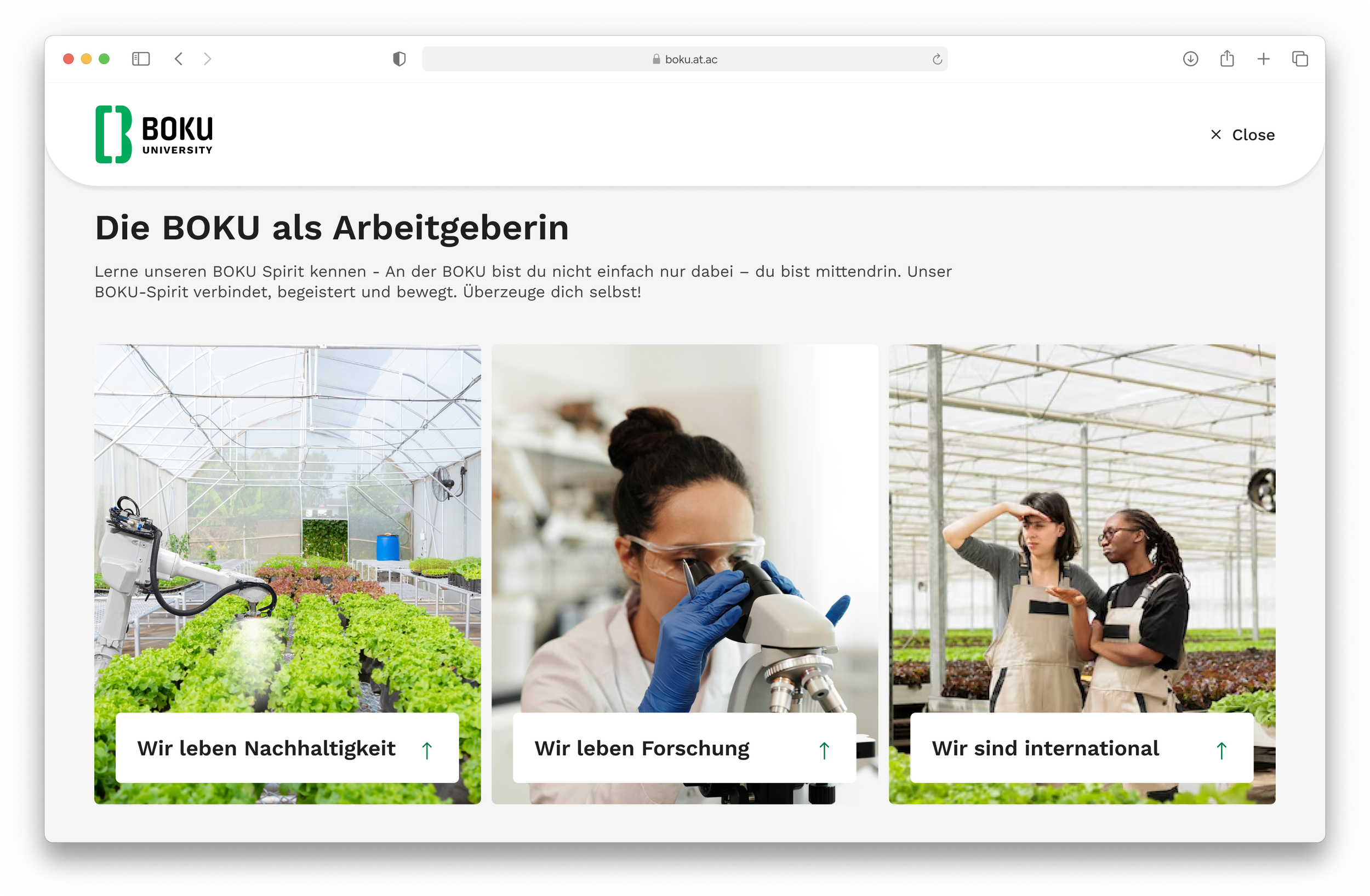
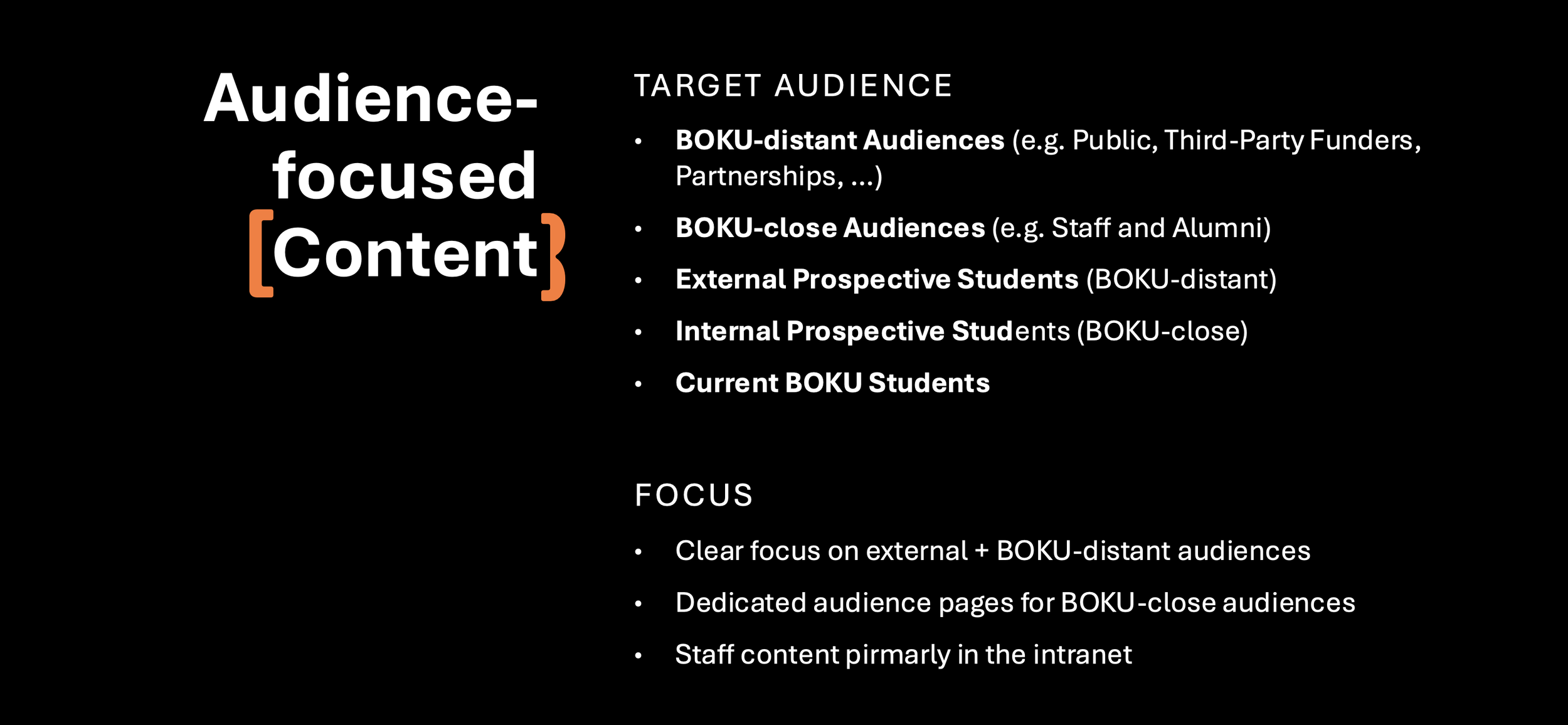
Seven full-day, in-person workshops. One recurring theme: every audience at BOKU has different needs — and every one of them deserved a dedicated place on the website. The answer was clear: a strict split between public site and intranet, with audience-focused content at the core.
Structure Follows Strategy
With the workshops still running in parallel, we began translating decisions into structure. Wireframing a university website means holding a lot in your head at once — and making sure nothing gets lost along the way. Each round was reviewed and signed off with the client before moving forward.
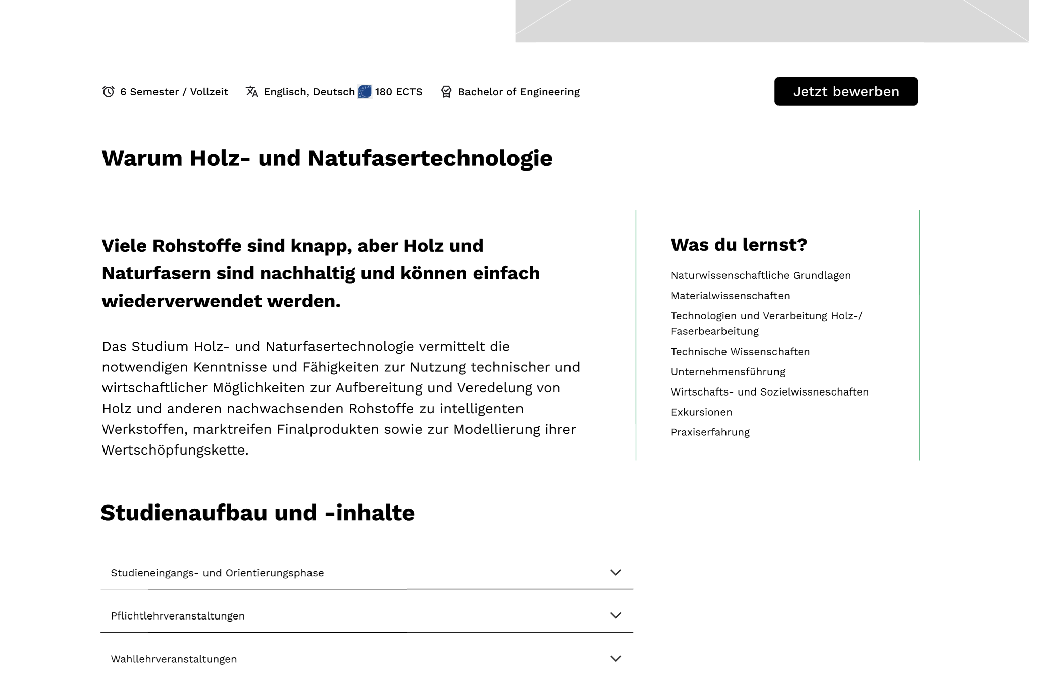
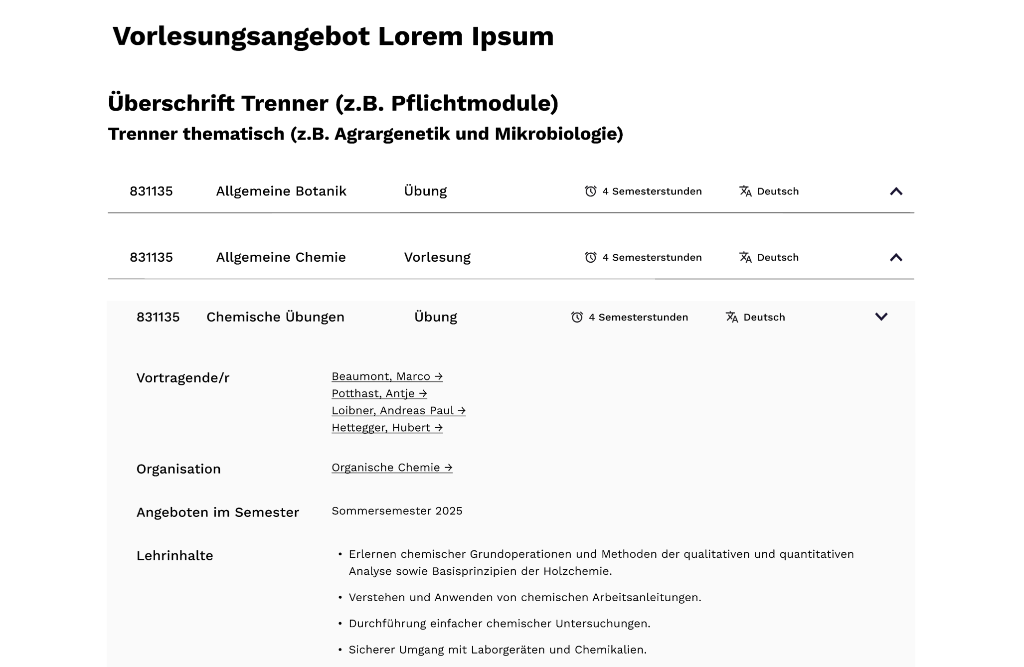
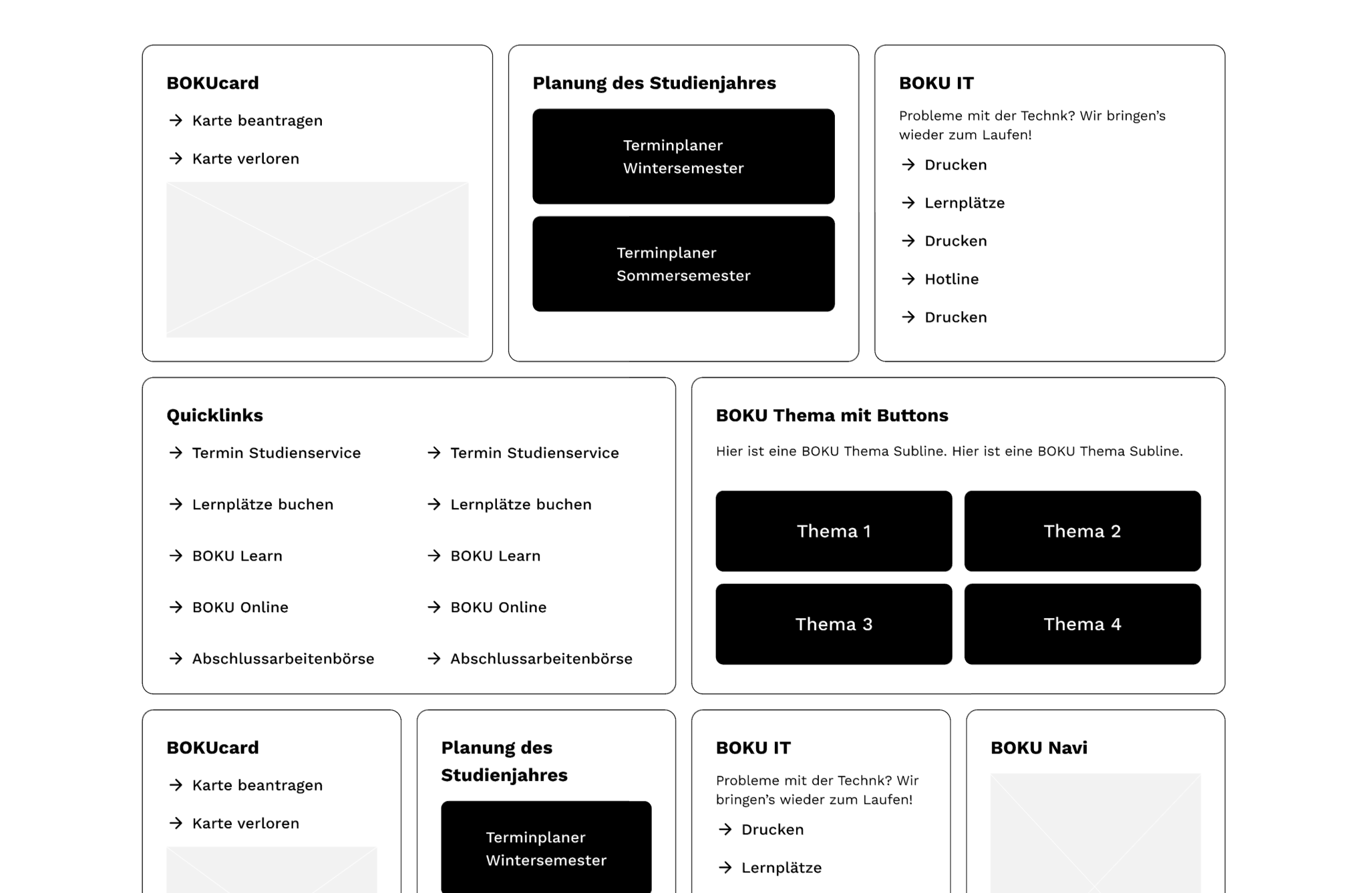
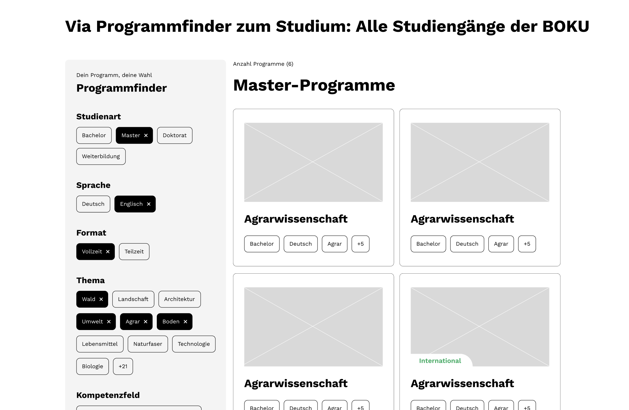
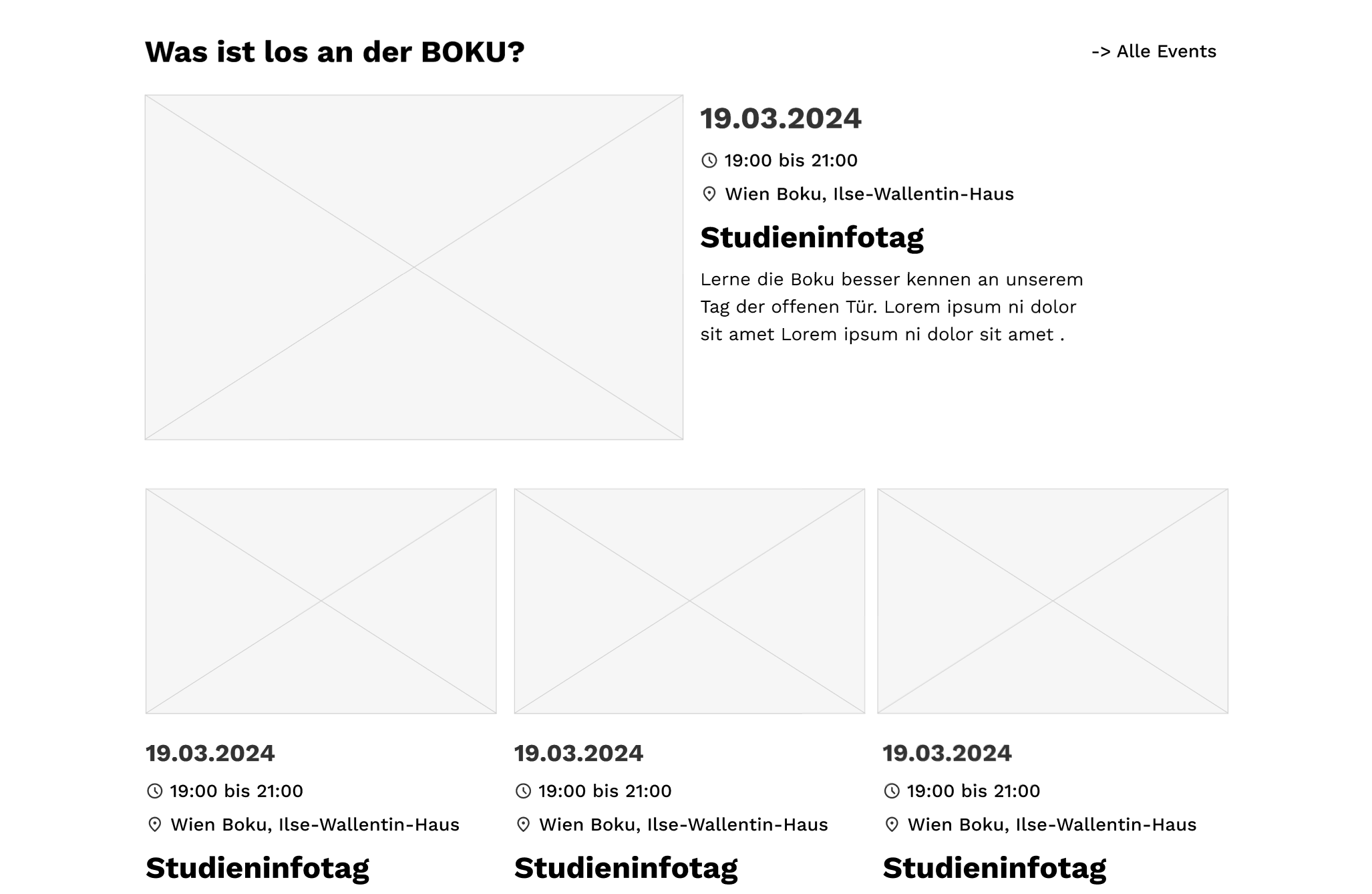
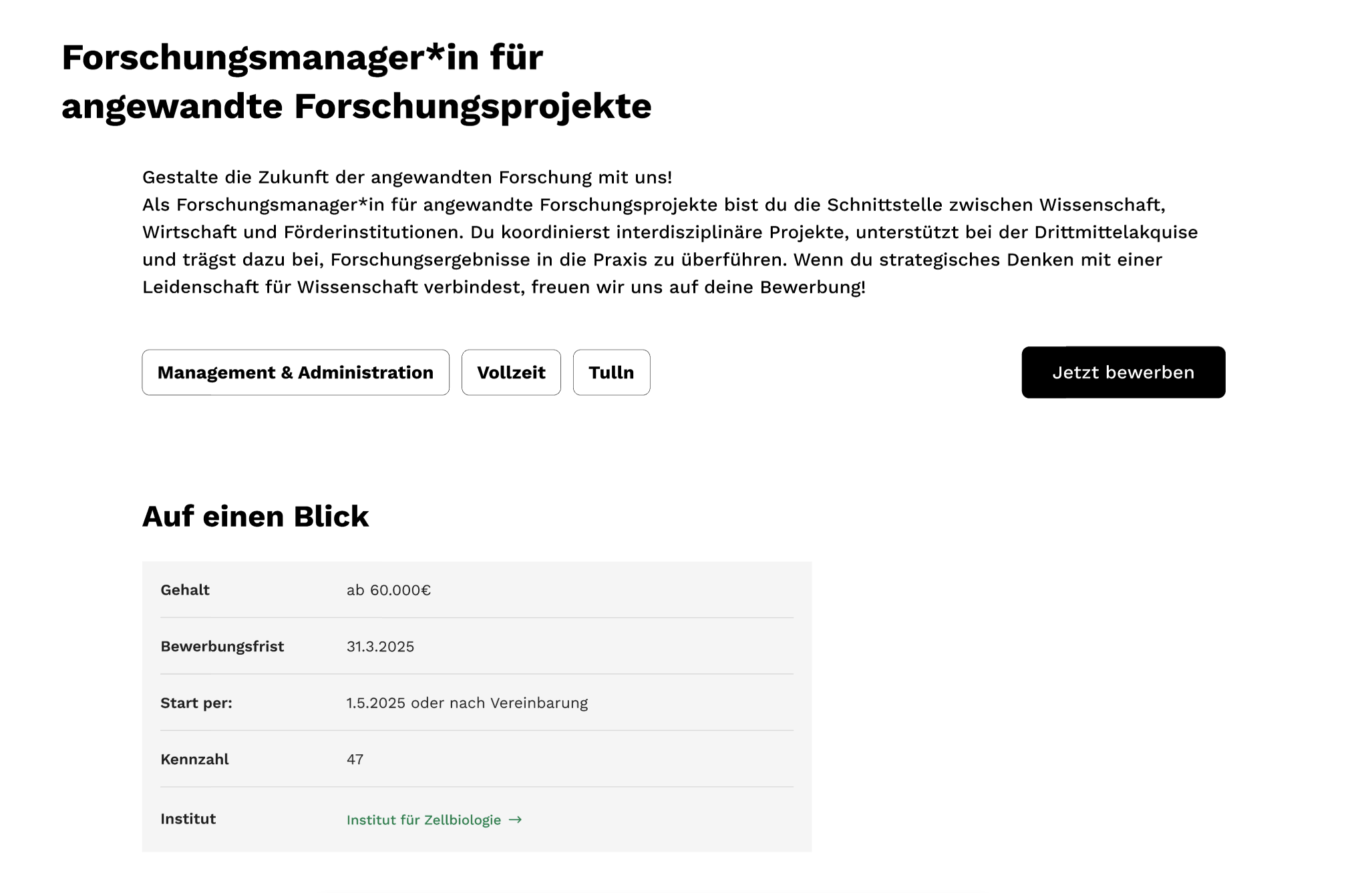
The Design Direction, articulated:
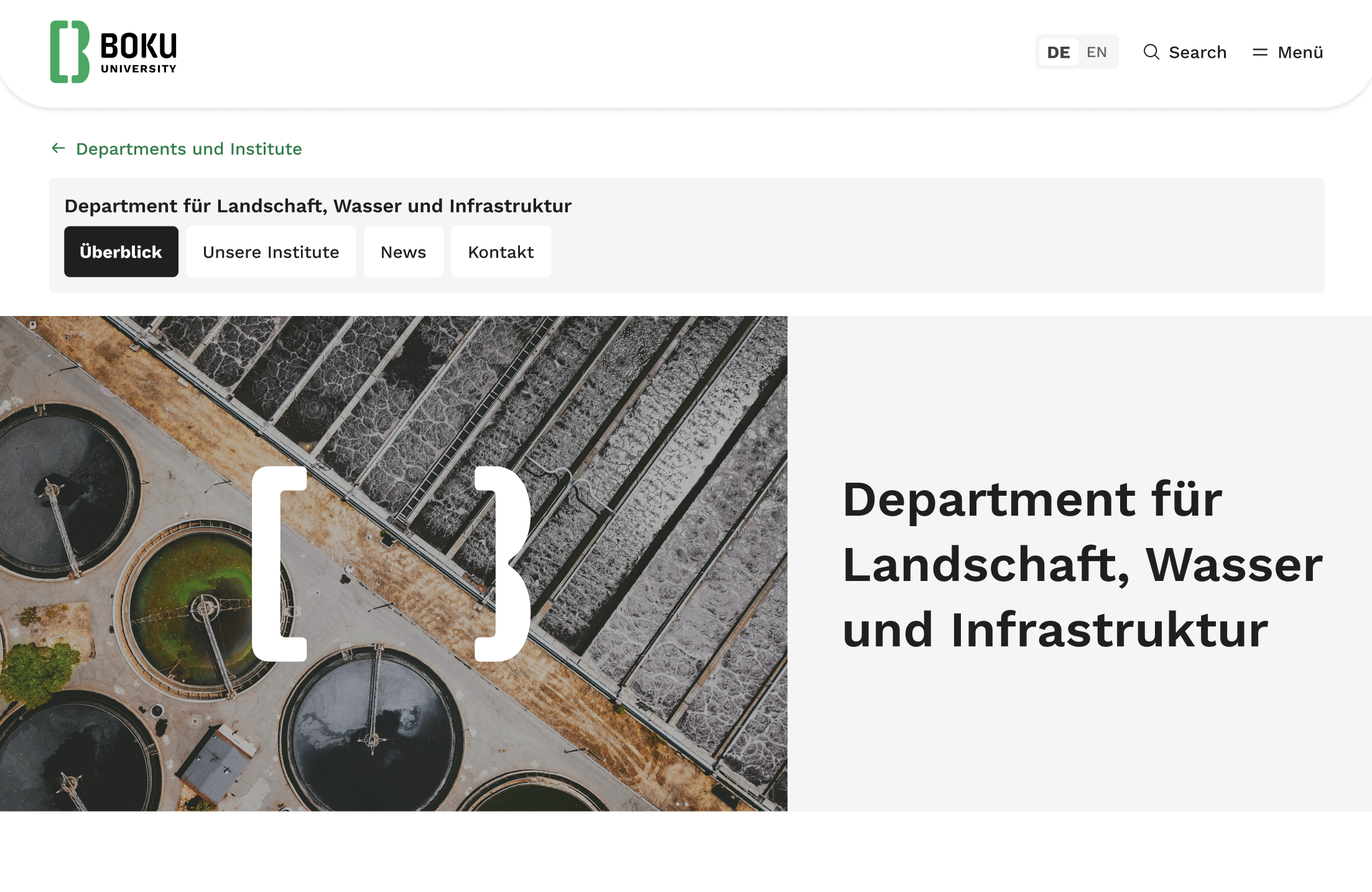
Modern, bold, and unapologetically in green — designed to make a 150-year-old university feel like the future.
Green means go
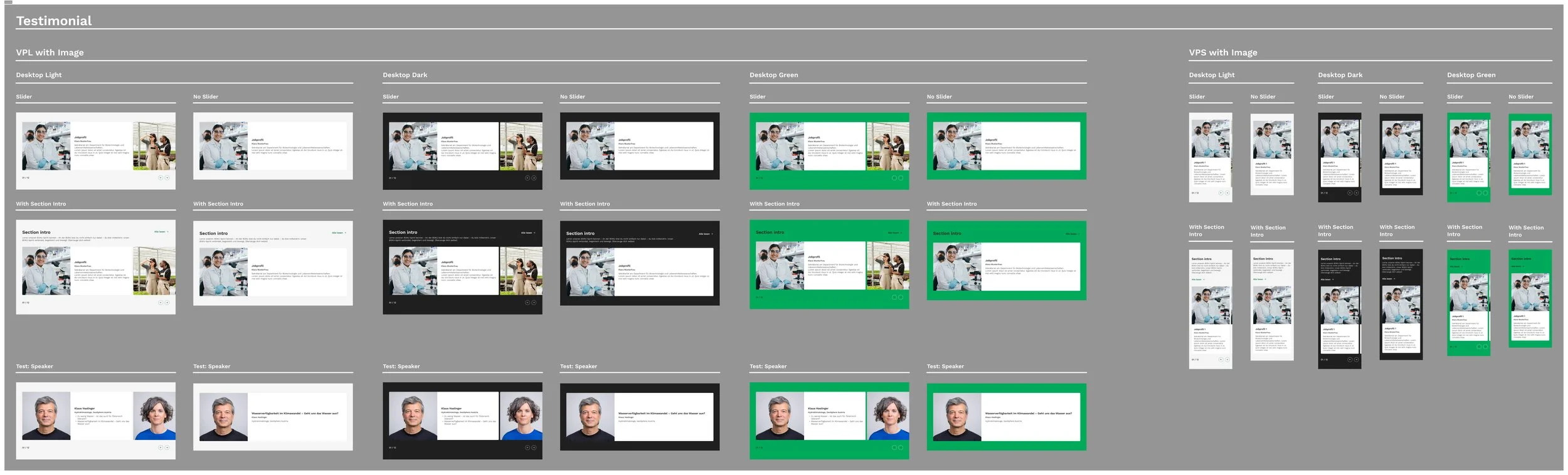
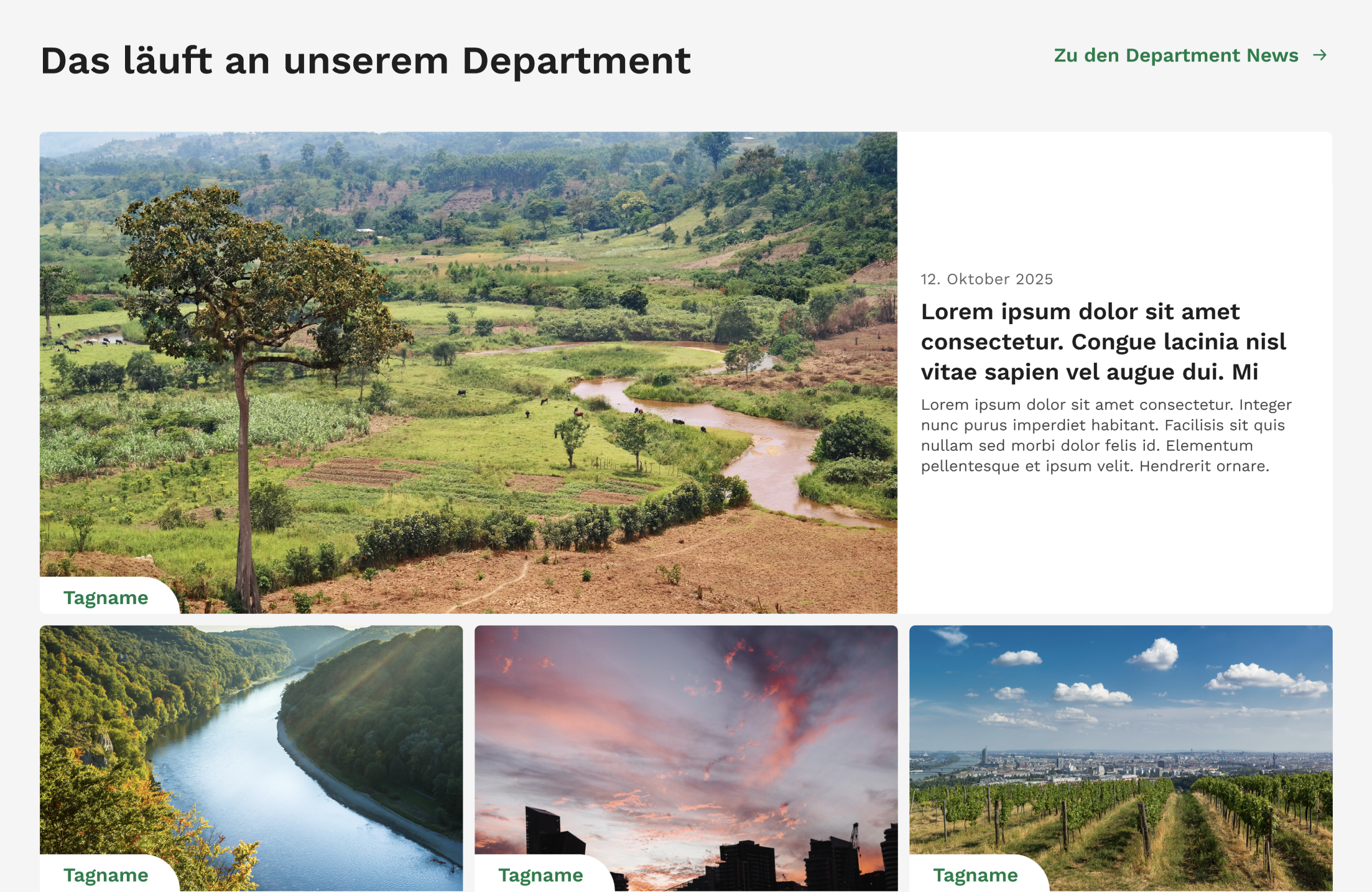
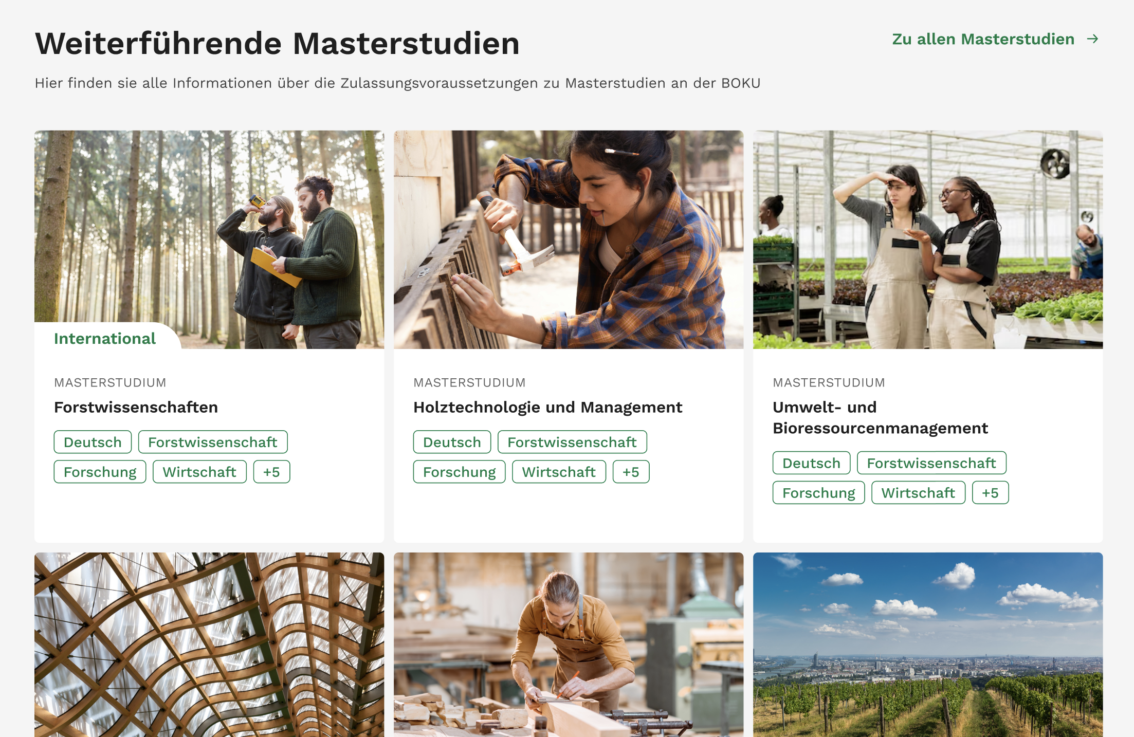
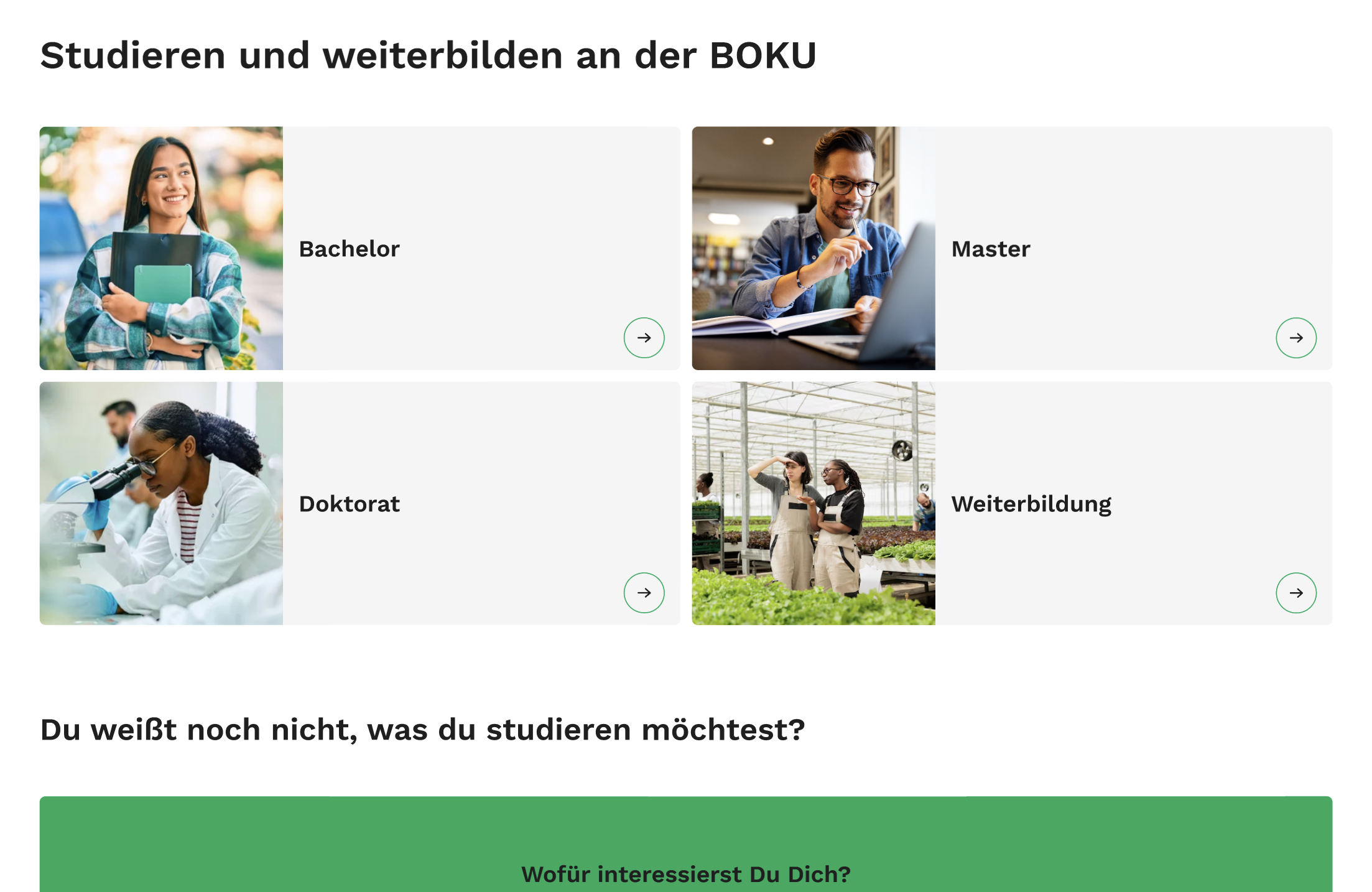
With a clear direction we built the UI and design system from the ground up. Every token, component, and pattern documented in Figma, ready to scale. The corporate green stayed, but the rest got a full reinvention: structured, vibrant, and built to carry a complex university website without losing clarity.