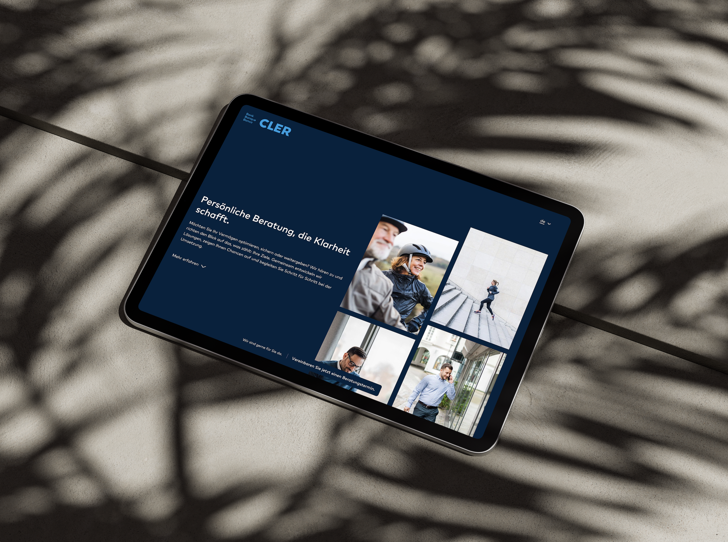
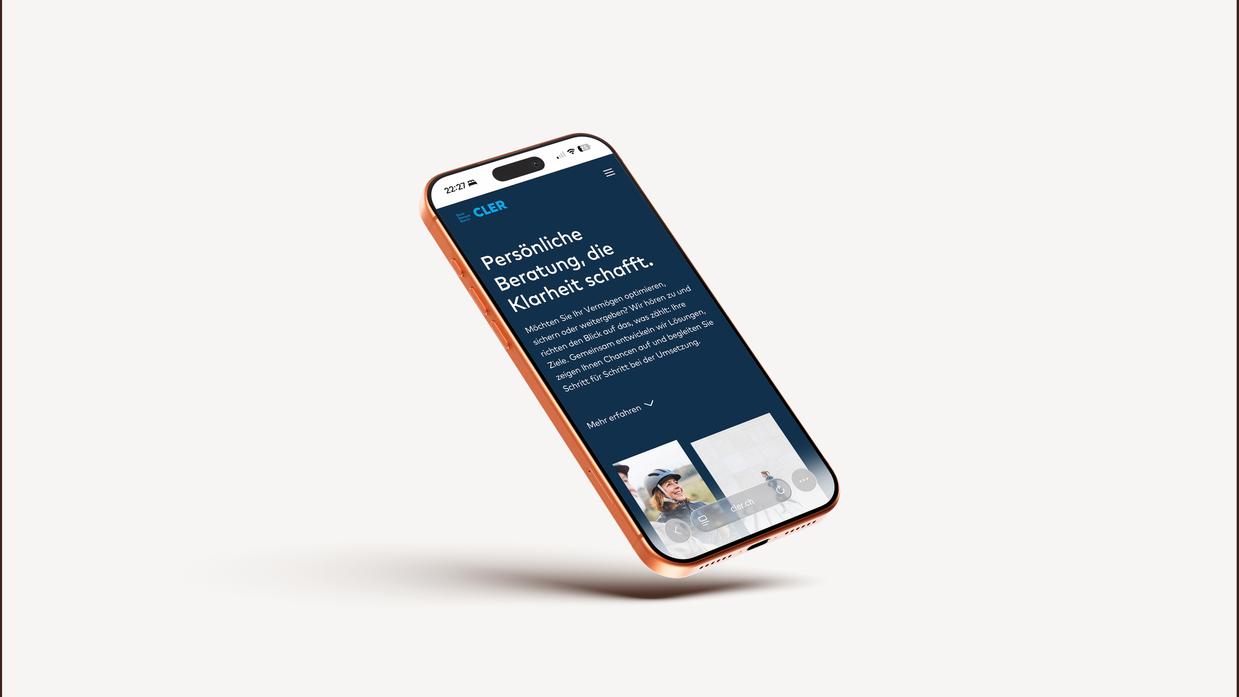
Money is Personal and so is the UX.
A UX concept for Bank Cler's new Private Banking section — designed around people, not products.
2025 / 3 months
year / duration
Financial Services
industry
Responsive Website
platform
UX Consultant
project role
Steps along the way
From early research to final structure, here's the process laid bare.
00 The setup
-
Bank Cler needed a dedicated Private Banking section on their website to address the needs of high-net-worth clients — a segment previously underserved in their digital presence.
-
Design the UX for a new Private Banking section that clearly communicates Bank Cler's wealth management offering and guides affluent clients toward a consultation appointment.
-
Desk research · Competitive analysis · Concept Mapping · Target audience analysis · User personas · User stories · Problem & hypothesis statements · Task analysis · User flows · Sitemap · Wireframes · Prototype · User testing · Iteration · Handover to UI
01a Before we build, we read
Private banking clients are sophisticated, time-poor, and increasingly starting their journey online — yet most banks greet them with generic product pages and clunky CTAs. Only 38% of wealthy Swiss clients are fully satisfied with their provider. The opportunity was clear: design an experience built around life moments and real goals, not product catalogues.
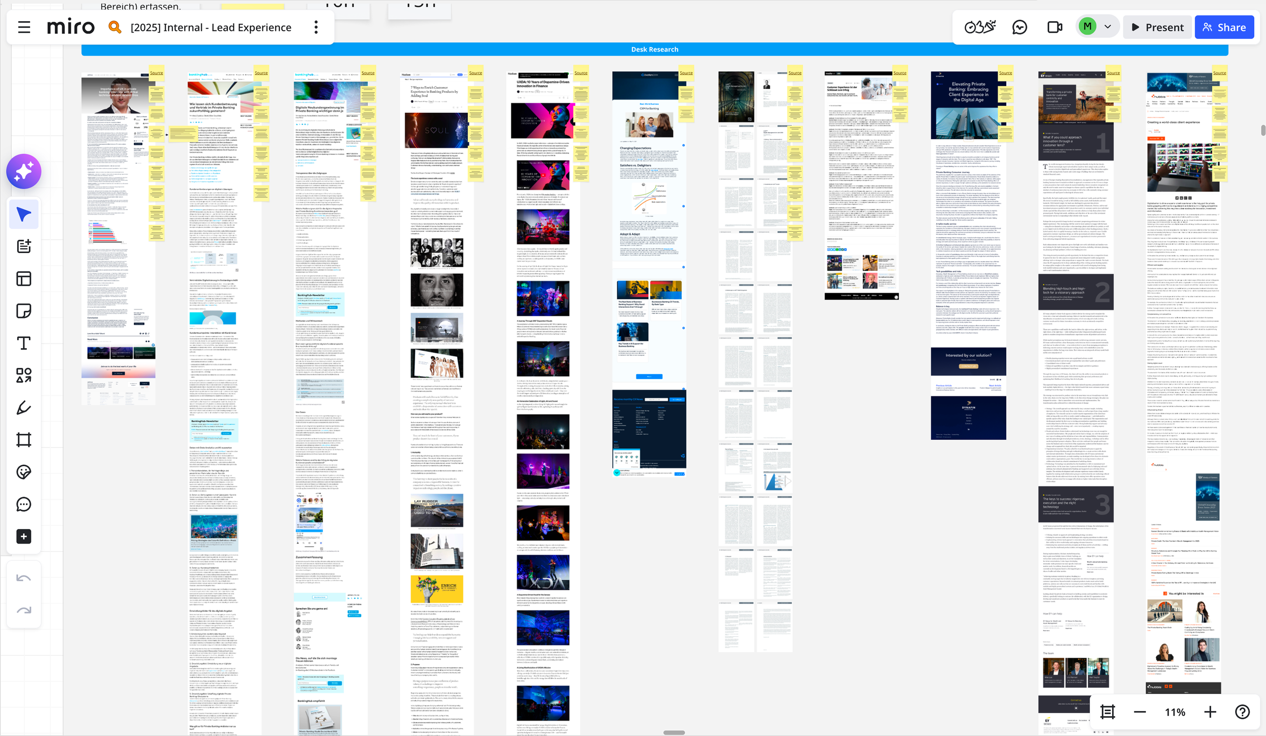
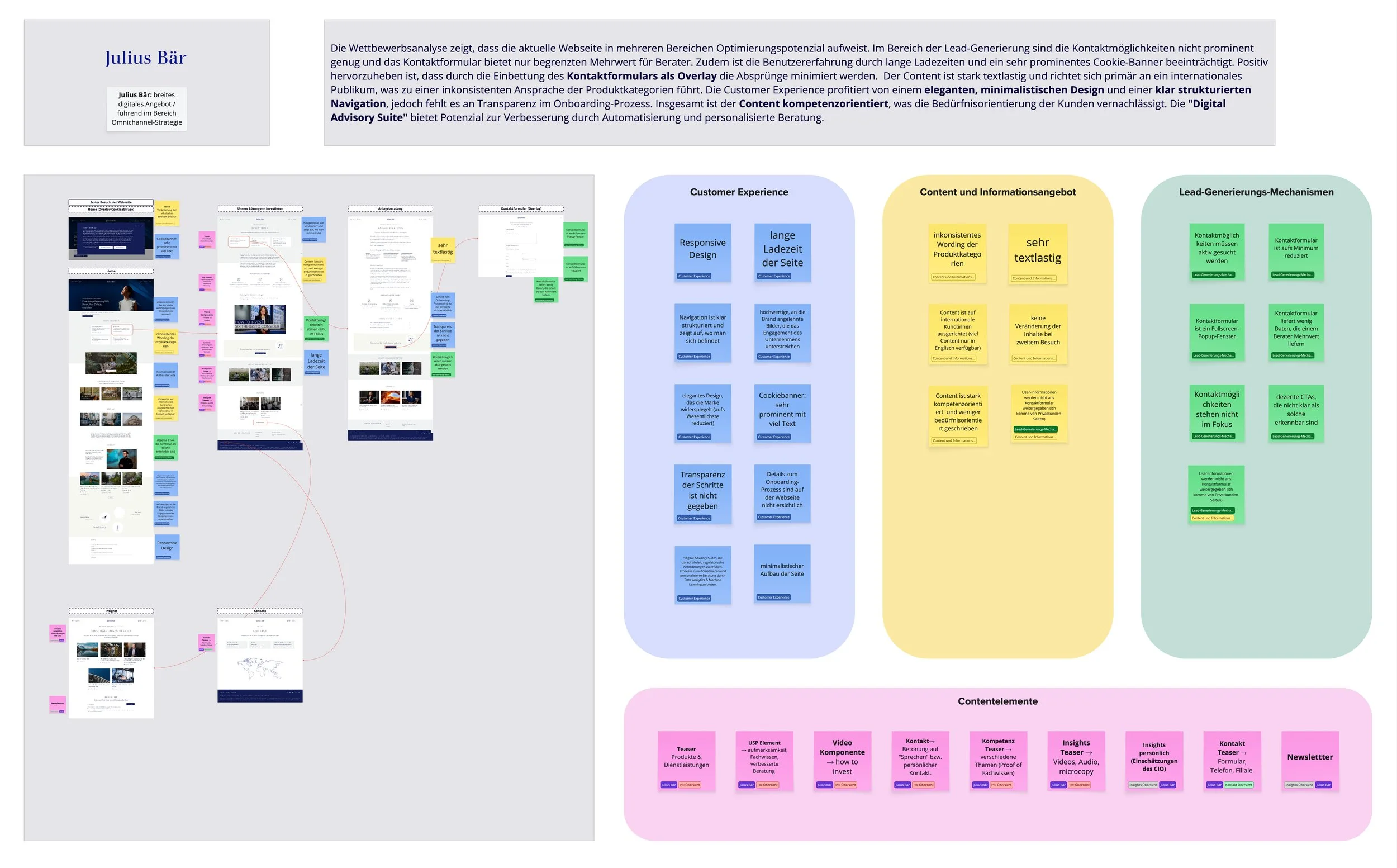
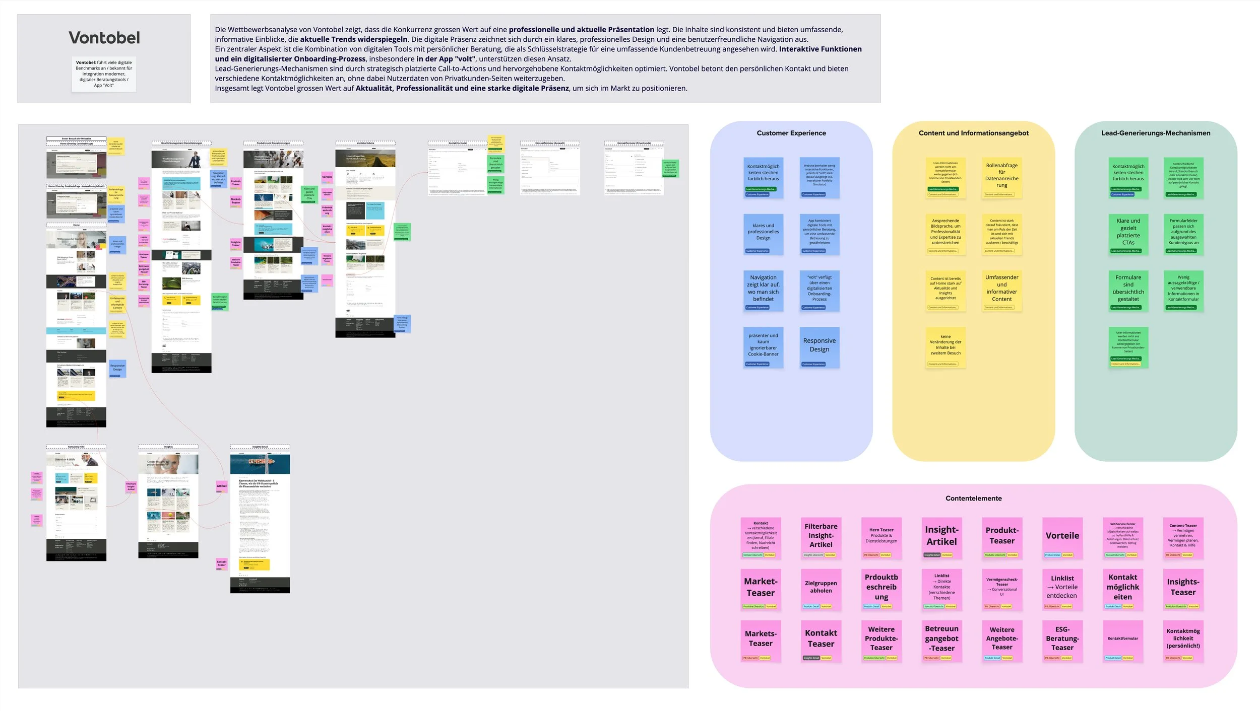
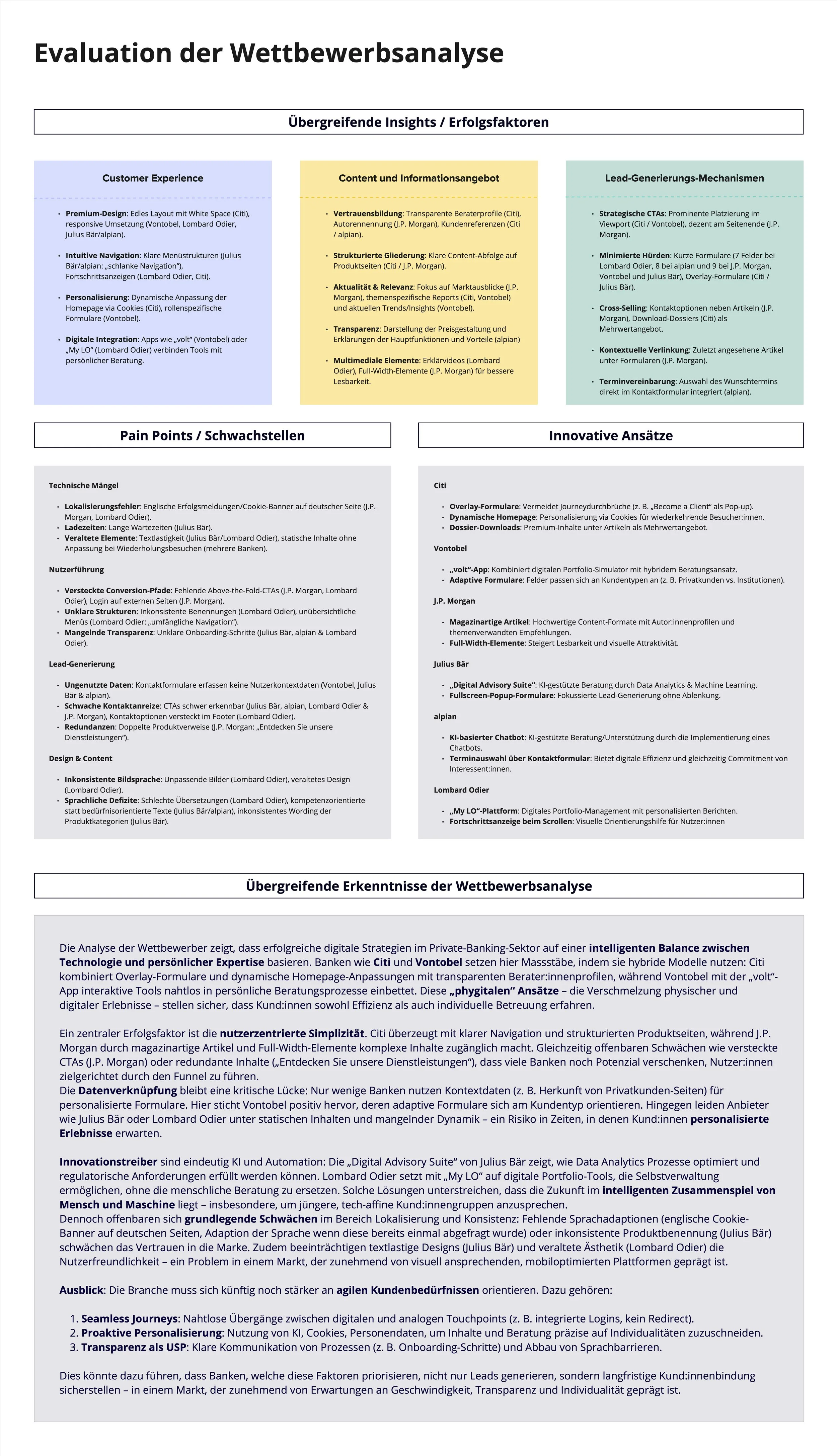
01b Who’s in the ring?
Julius Bär, Vontobel, Lombard Odier, Citi, JP Morgan — the best players all lead with life moments, not product lists. They earn trust through clarity, proof points, and a seamless blend of self-service and human contact. The pattern was clear: curated experiences convert, generic pages don't.
Before diving further into personas and flows, the concept framework was mapped out. All five workstreams converge into one coherent concept — the foundation for every structural and design decision that follows.
01 Research Analysis
Desk research and competitive analysis to understand the market, the players, and the gaps.
02 Define the Goal
Formulating what the Private Banking section needs to achieve — for the business and for the user.
04 User Stories & Problem Statements
Articulating what each persona is trying to do, where the current experience fails them, and what could fix it.
03 Audience & Personas
Translating audience groups into three actionable personas with distinct needs and expectations.
05 Task Analysis & User Flow
Mapping how each persona moves through the experience — from entry point to consultation.
02 The Goal, defined:
To create a trustworthy digital first impression that builds confidence, provides orientation, and opens the door to a personal banking relationship — especially for clients who've never had one.
The client came prepared — three target groups were already defined from prior workshops. From these, three personas were derived: Lea, who wants to build wealth independently; Markus, who demands strategic depth; and Therese, who values personal contact above all.
03 Who are we designing for?
04 What do they actually need?
With the personas defined, the next step was to articulate what each user is really trying to accomplish — and where the current experience falls short. Three user stories per persona, paired with problem statements and hypotheses, gave the design a clear direction: all three users want to assess fit on their own terms before committing to a conversation. The common thread — orientation, trust, and a frictionless path to the next step.
05 Mapping the journey
With personas and problems in hand, the focus shifted to how each user actually moves through the experience. A task analysis per persona — covering goals, entry points, success criteria, and task steps — fed directly into three user flows. The synthesis revealed a clear pattern: all paths lead to the same destination, but the route looks different for each user. These flows became the backbone of every structural decision that followed.
The UX Concept, articulated:
Two levers would drive the experience: a segment-based overview page that lets each user self-identify instantly, and a high-quality insights section that builds trust and expertise.
Soft lead paths, visible advisors, and subtle personalisation would do the rest.
With the concept locked, these UX recommendations translated strategy into concrete direction — a practical playbook for every decision that followed.
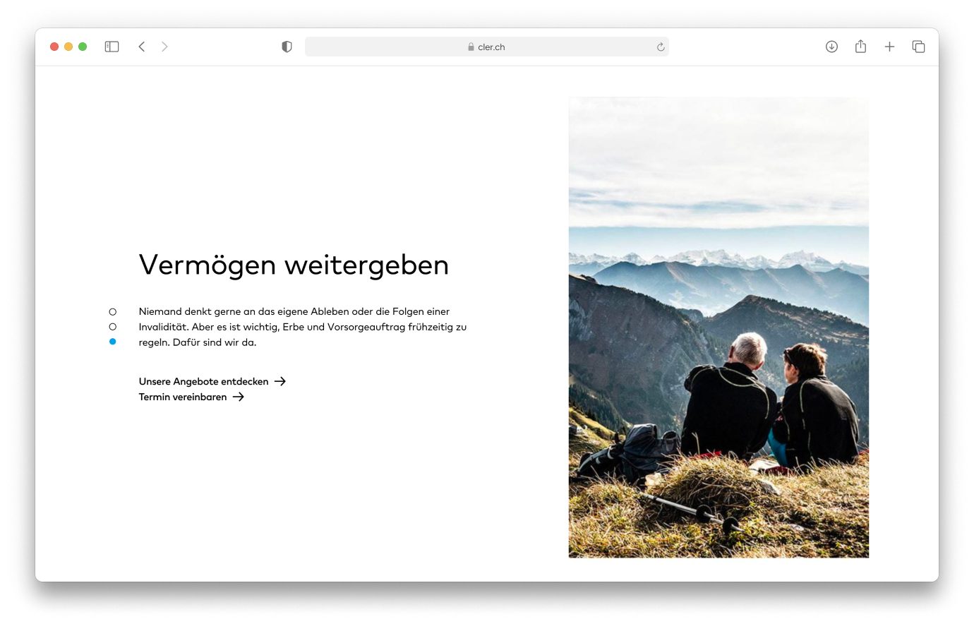
Segment-based entry via life goals, not product categories
Clear overview page with 3 core areas
Consistent navigation, including mobile
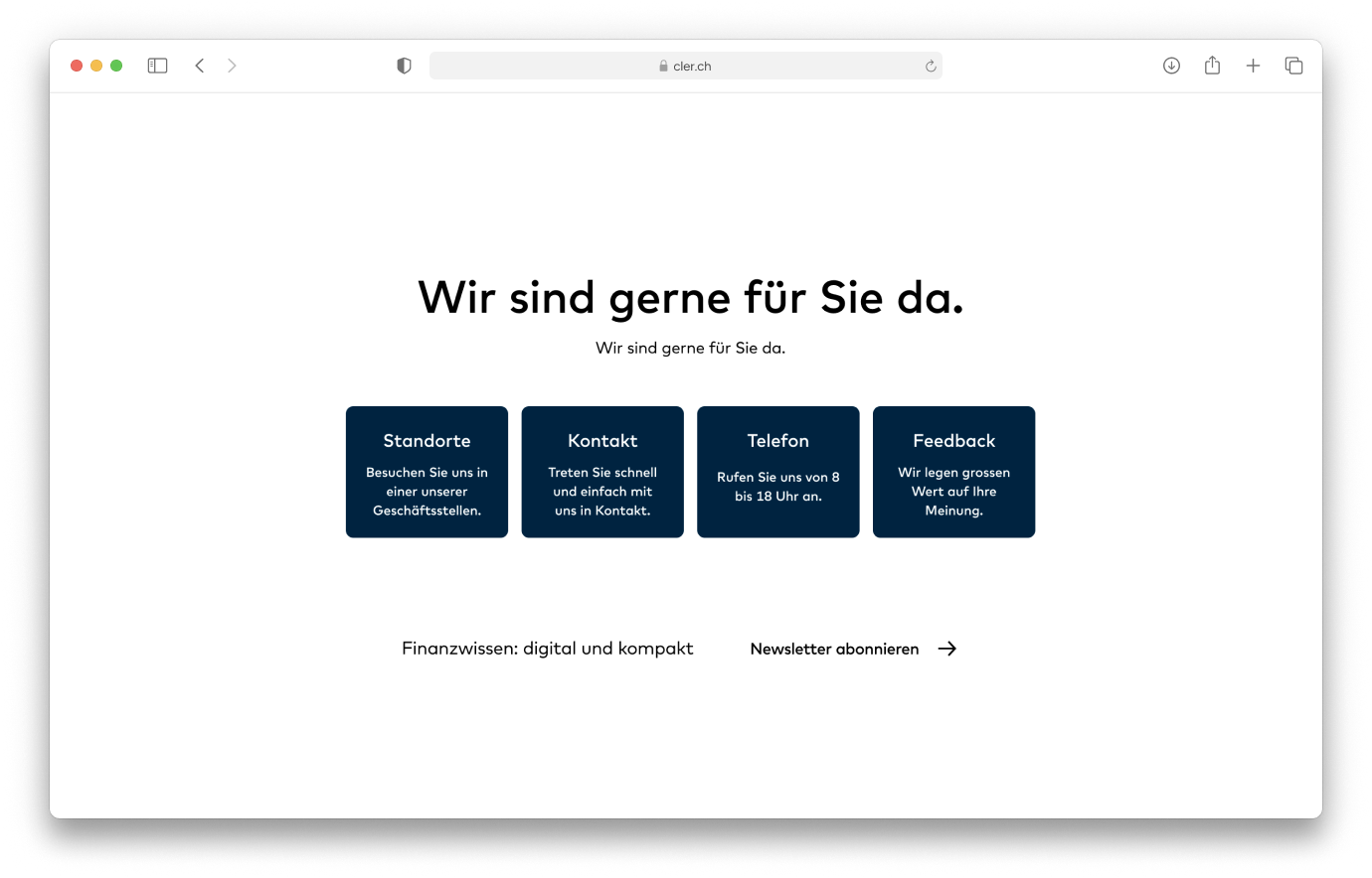
Entry & Structure
Soft lead paths instead of hard "Book now" pressure
Appointment booking with topic pre-selection
Background triage logic for targeted lead follow-up
Lead Generation
Interactive tools per persona
Flexible channel switching at any point
Tools & Interaction
Visual design and language adapted per persona
Advisors presented visibly and personally
Personas & Tone
Insights section as trust & expertise anchor
Thematically focused content hub with per-persona assignment
Multi-format: checklists, FAQs, videos, whitepapers
Content & Insights
Security signals & data privacy communication
Subtle personalisation — relevant without feeling watched
Trust
Building the architecture
With the concept and recommendations in place, the site structure took shape. The overview page acts as the entry point and triage layer — guiding users via a soft lead path to one of three goal-based detail pages (build, manage, or pass on wealth). A dedicated insights section runs alongside, accessible from anywhere in the experience.
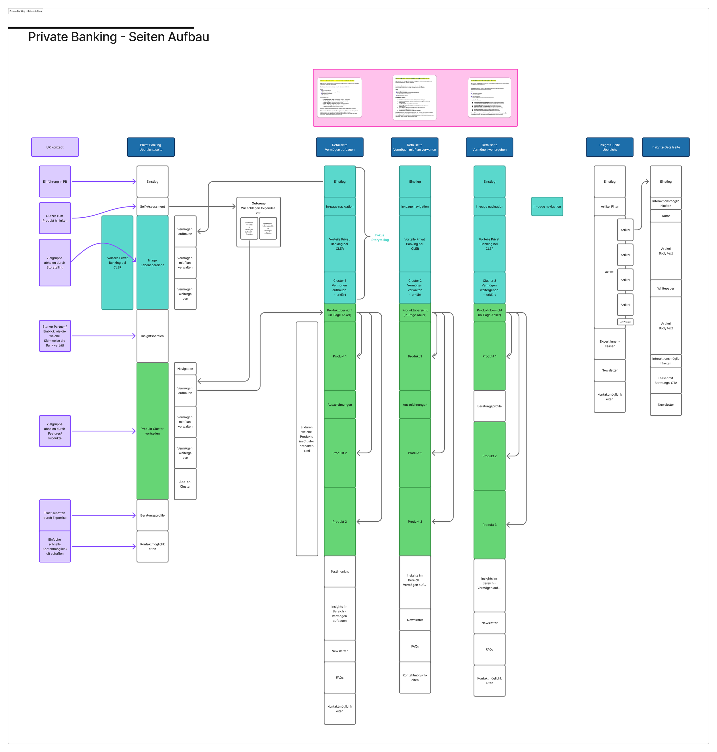
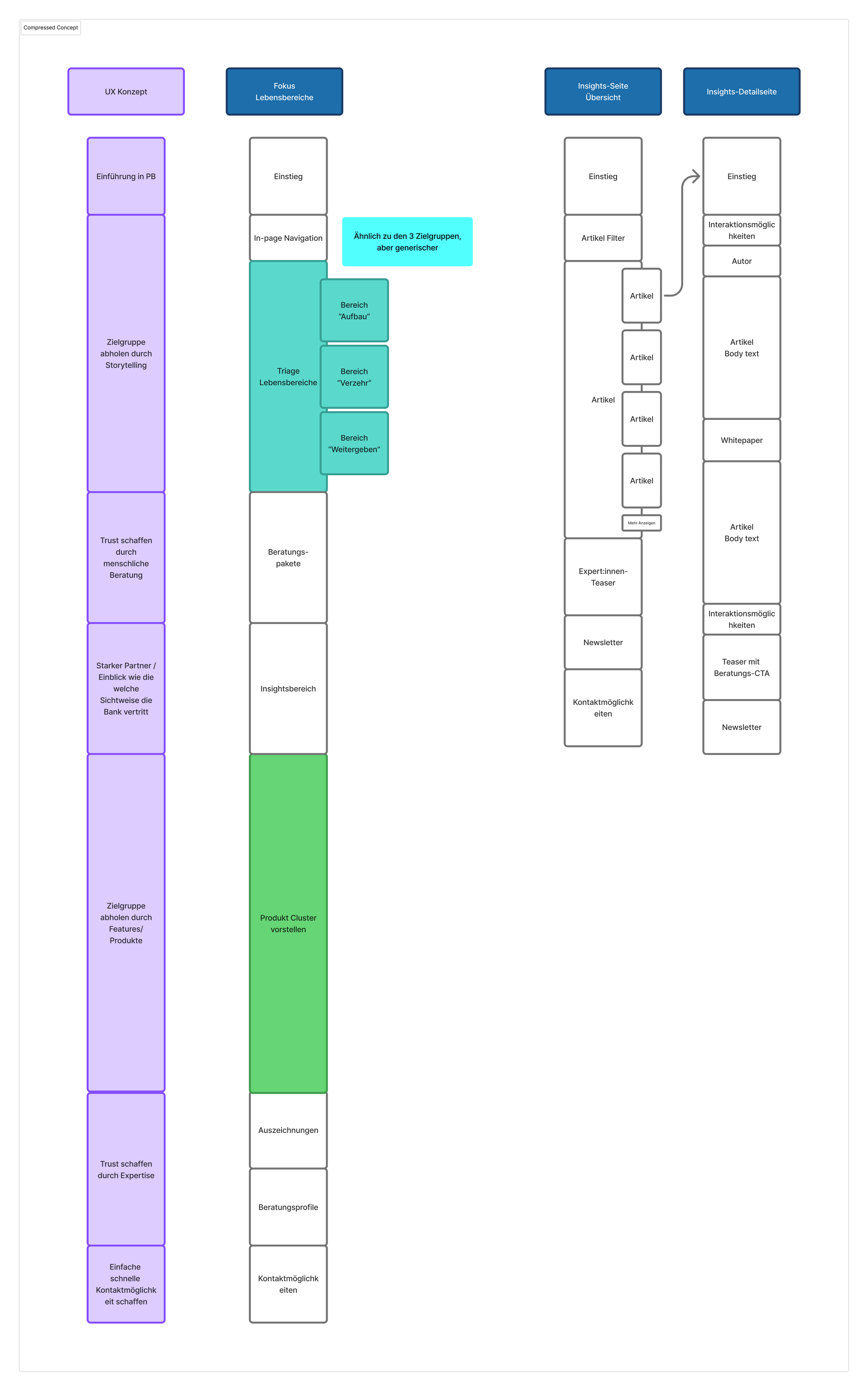
Reality hits, architecture shifts
The concept landed. The scope didn't. Three subpages had to be merged into the overview page — so we compressed, brainstormed, and rebuilt the architecture around that constraint.
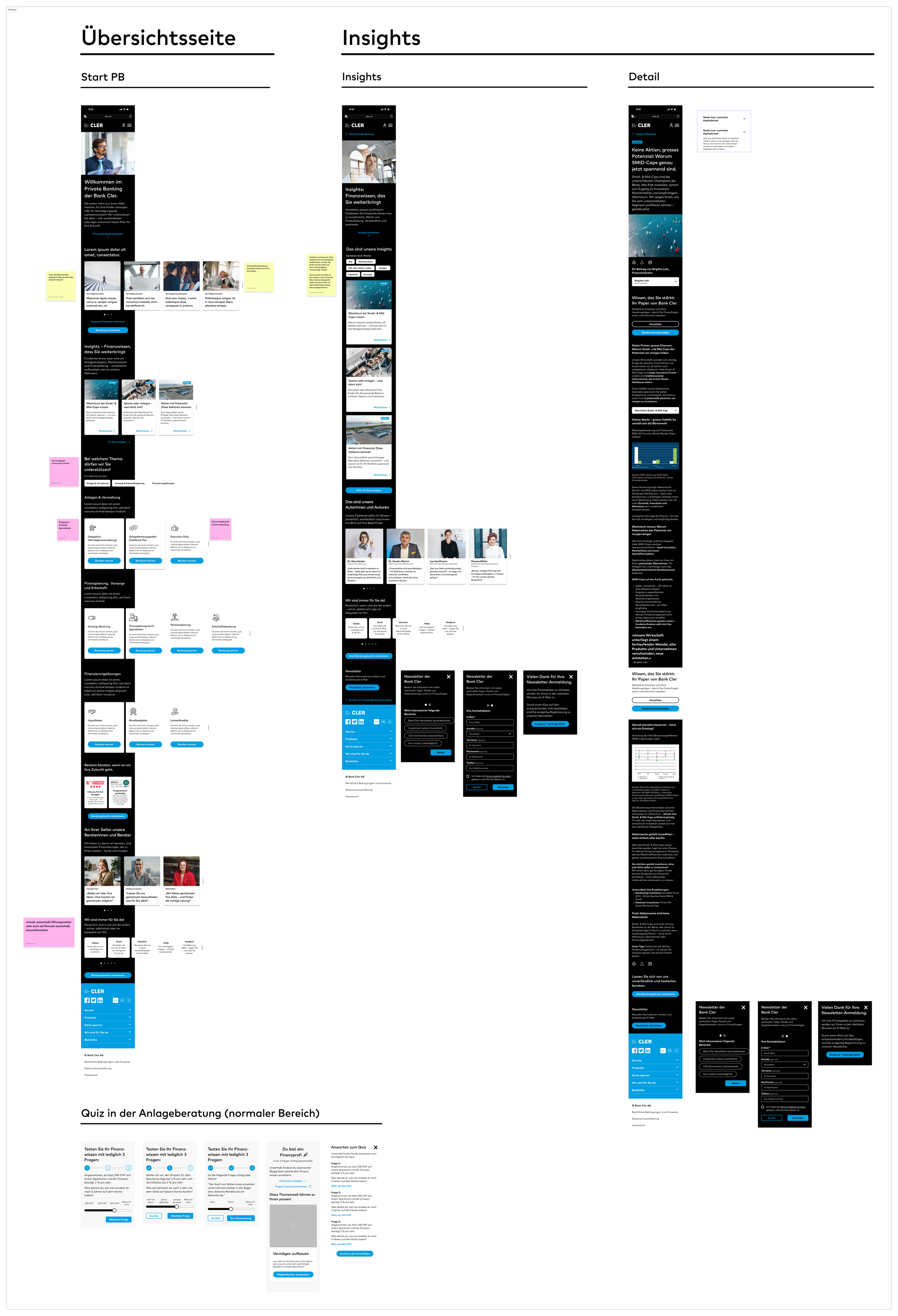
From structure to screens
With the architecture set, wireframes came next — built fast using the existing design system. Reusing components kept things efficient. The wireframes fed directly into a prototype, which we used to test the flows.
Lesson learned
What worked
The project delivered what it set out to — a solid, well-considered foundation for the Private Banking section. Despite the pressure, the result is a stable starting point for future iterations. The deep domain immersion paid off: the knowledge built here will directly benefit what comes next.
What I'd do differently
Start leaner. The volume of UX recommendations was well-grounded, but should have been filtered and compressed earlier. Less, but sharper — that would have brought focus sooner. And constraints need to be on the table from day one. The late clarification around the detail pages created avoidable stress right before testing. An earlier, binding checkpoint with the client — with a clear decision on what's in and what's out — would have been the right move. I should have pushed for that more assertively.
What comes next
The concept has more potential than this project scope could fully unlock. With more budget, there's a strong foundation to build on — and that's exactly what I'm looking forward to. A good start has been made.