
Application
Vocalogy
This project, undertaken as part of the CareerFoundry curriculum, focuses on designing a mobile application that helps users efficiently learn and memorize new vocabulary.
The goal was to explore the user experience design process, from conducting competitor research and user interviews to developing user personas and user flows. A key objective was to produce a low-fidelity prototype, followed by usability testing to assess the app’s functionality and user-friendliness.
The project emphasizes understanding user needs and creating intuitive, accessible solutions without advancing into the high-fidelity or implementation phases.
Client:
CF – CareerFoundry
(Student Project)
Company:
–
Year:
2024
Tools:
Figma, Procreate , ChatGPT
Briefing.
Redesign the experience of memorizing and understanding new concepts, techniques, and terms by exploring how people learn vocabulary and designing a mobile app to address their goals and problems.
Scope.
-
Design a low-fidelity prototype for a mobile app that helps users efficiently learn and memorize vocabulary through short study sessions.
-
Onboarding: A smooth introduction for new users.
Login/Signup: Simple and secure account creation and login.
Home Screen & Admin Area: Central hub for navigation and managing user profiles.
Vocabulary Upload: Feature to add new words with personalized definitions.
Reviewing Vocabulary: A tool to help users regularly review and reinforce vocabulary.
-
User Research: Conduct interviews to understand user needs and behaviors.
Task Analysis and User Flows: Map key tasks like onboarding and learning.
Wireframing and Prototyping: Create wireframes and build a low-fidelity prototype.
Usability Testing: Conduct tests and revise the prototype based on user feedback.
-
High-fidelity design, final implementation, and advanced features.
-
1 month.

Excerpts of the progress.
This section highlights key steps in the project’s development, from initial research and persona creation to wireframes and usability testing.
Each excerpt reflects the iterative process of refining the app’s design, focusing on user needs and improving functionality.
Who’s in the ring?
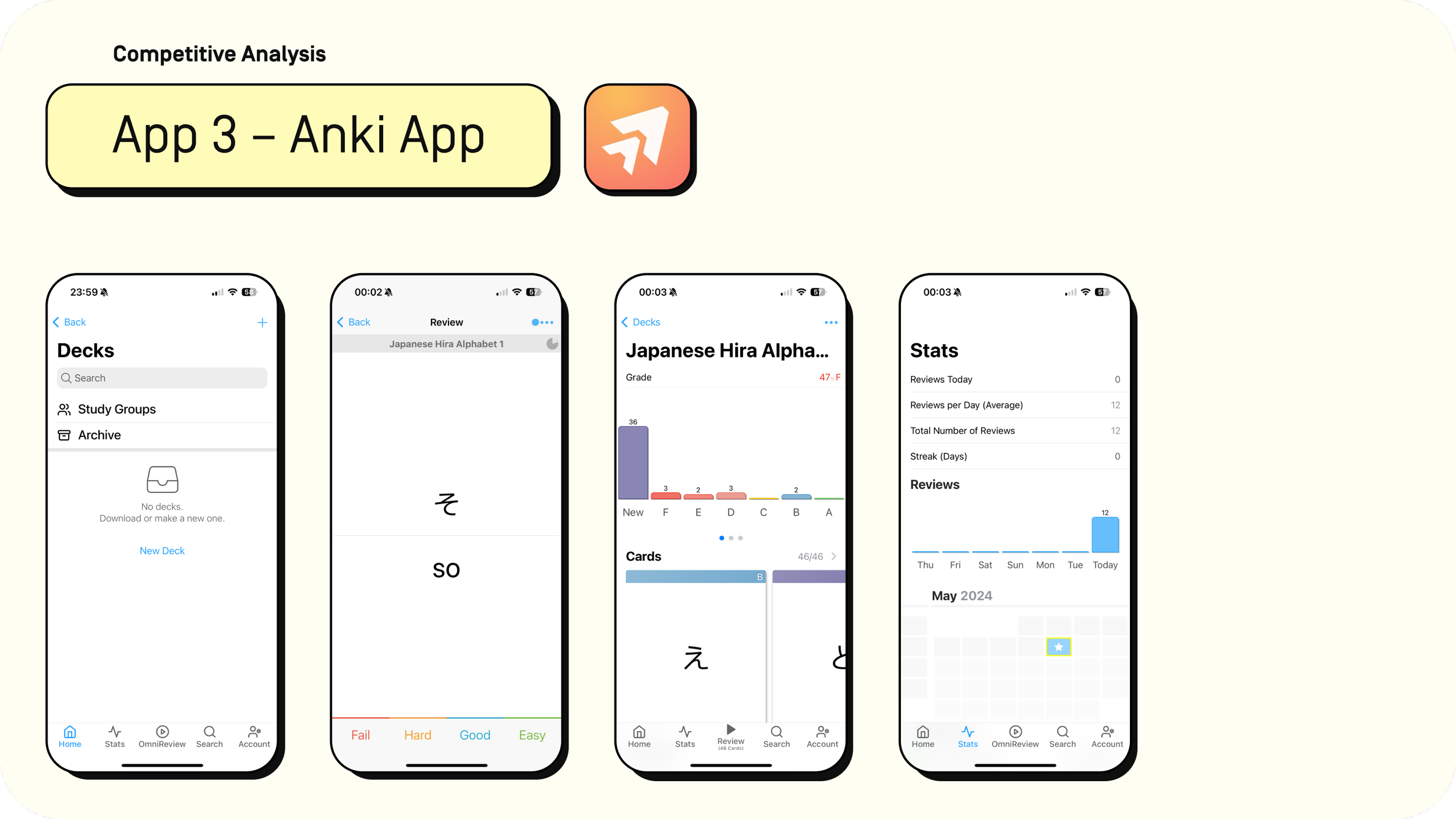
Let’s dive into a competitive analysis of three popular vocabulary learning apps: Quizlet, Vocabulary, and Anki. I examined each app based on ease of use, the effectiveness of its features, overall product success, and areas for potential improvement.
This analysis helped identify strengths and weaknesses across the apps, providing valuable insights for designing a more effective and user-friendly vocabulary tool.



Hearing it firsthand.
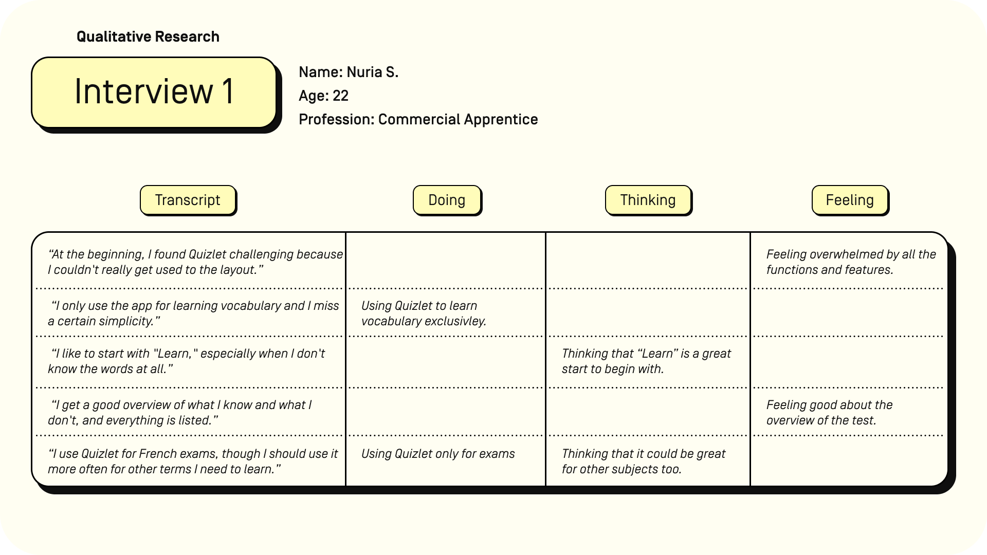
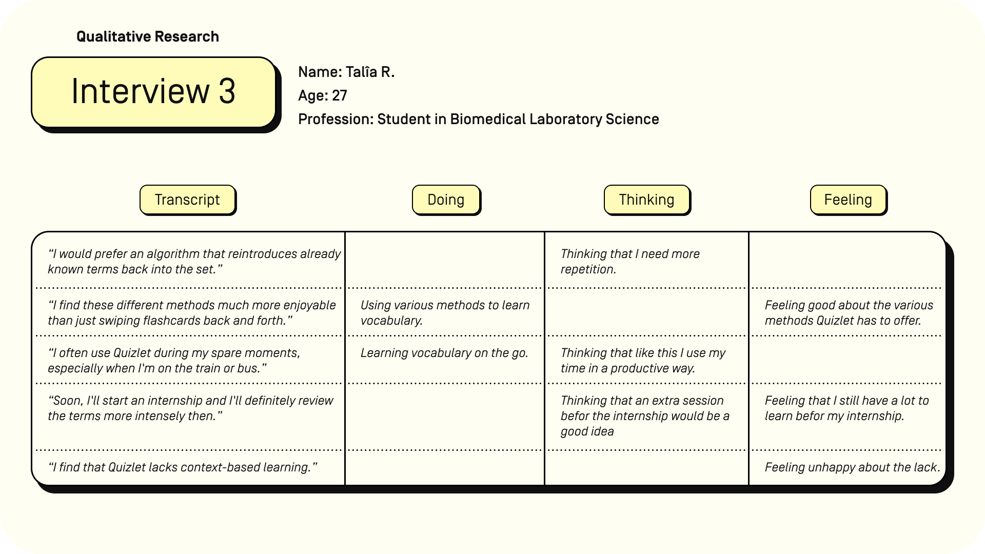
Through a series of three user interviews, I explored how people engage with learning vocabulary.
By capturing their thoughts in their own words, I organized their responses into what they are doing, feeling, and thinking. These insights reveal key behaviours, frustrations, and beliefs, offering great inspiration for designing an app that meets user needs.
User Interview questions:
-
Can you share a detailed walkthrough of your typical day, highlighting any routines or activities you regularly engage in?
-
Can you share an example of a time when you struggled to remember a new word or a concept and the strategies you used to overcome it?
-
Have you ever used a learning or flashcard app? If yes, can you describe the last time you used it and what motivated you to use it? If no, can you tell me more about why you decided not to use this kind of app?
-
What challenges or frustrations have you experienced while using vocabulary apps?
-
What specific features do you find most useful and engaging in a vocabulary app and what methods do you prefer for studying new vocabulary and why?
-
How do you incorporate the usage of vocabulary apps into your daily routine, and how much time do you typically spend on them?
-
What motivates you to continue using a vocabulary app, and what additional features would enhance your learning experience?




It’s nice to meet you, Emma!
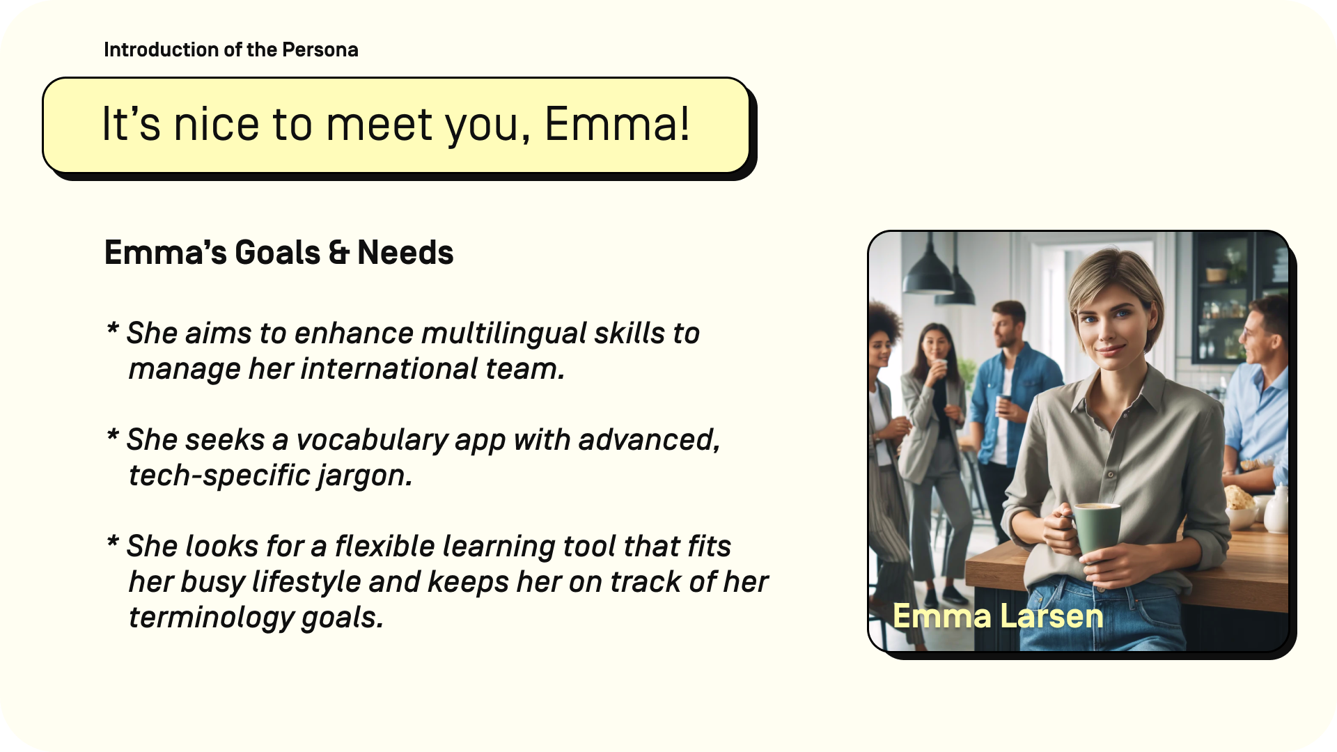
Say hello to Emma, my proto-persona and the face of the typical user for vocalogy.
Emma’s story helpes diving into her world–her goals, frustrations, and what truly motivates her.
Alongside Emma’s user stories, I’ll also present the problem and hypothesis statements that shape the design process.



Flowing through the app.
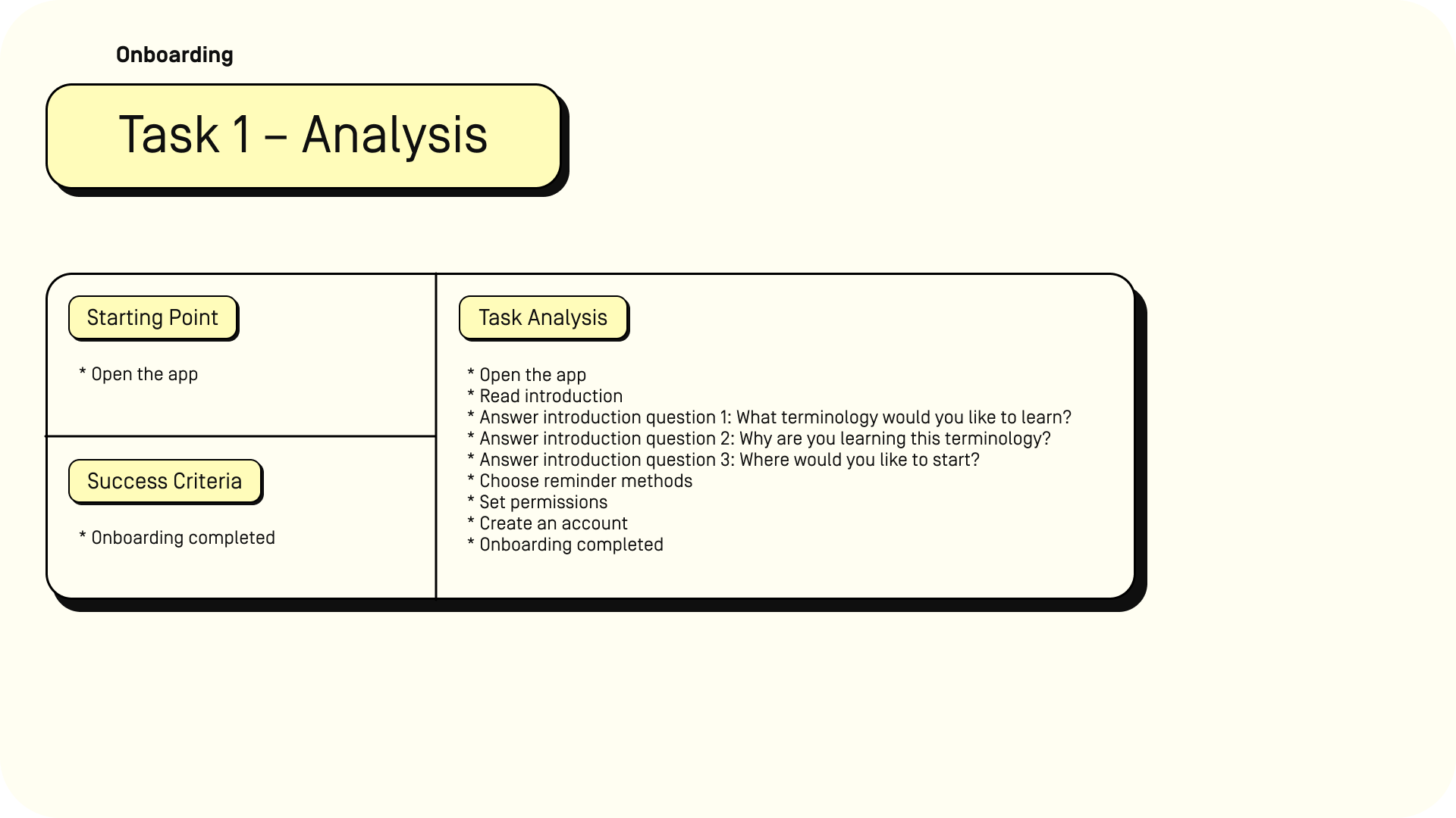
To better understand how Emma would interact with the app, I first performed a task analysis for two key tasks: onboarding and learning vocabulary. This helped break down Emma’s journey step by step, identifying critical interactions and potential pain points.
Following the task analysis, I created detailed user flows for each task, mapping out how Emma navigates through the app. These flows and analyses work together to ensure the app provides a smooth, intuitive experience from start to finish.


The app’s skeleton.
To bring the design concept to life, I created wireframes for key features of the app, including the onboarding process, login/signup, home screen & admin area, vocabulary upload, and reviewing vocabulary.
These wireframes provide a structural view of how the app’s layout and functionality come together. Using these wireframes, I built the first prototype, which served as the foundation for usability testing. Stay tuned for more details on this in the next section


Putting it to the test.
To ensure the app’s design met user needs, I developed a comprehensive usability test plan and script.
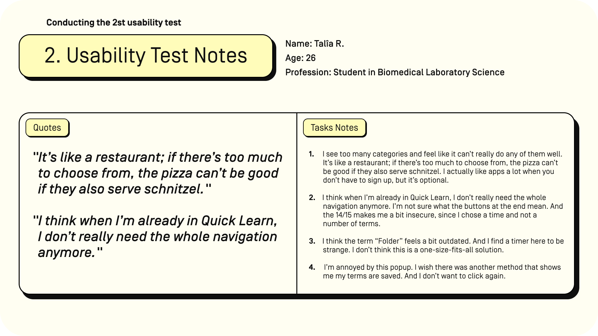
After conducting the usability tests, I extracted key insights into usability test notes, capturing the most important feedback from users.
This feedback informed a detailed usability test report, which guided revisions to the initial prototype, improving both functionality and user experience.




Bringing it all together.
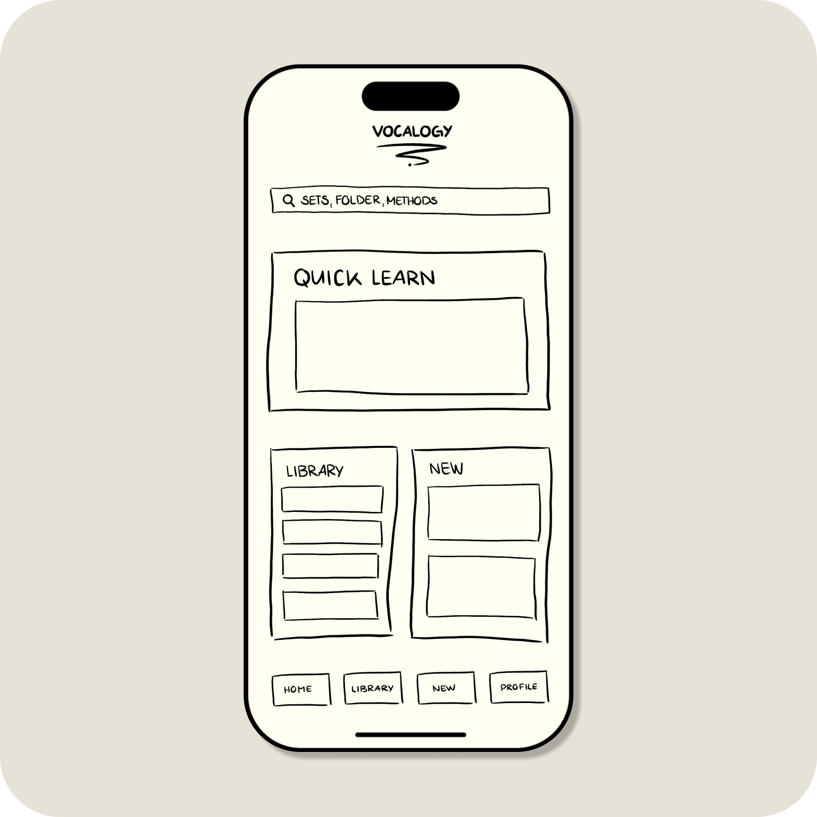
After gathering feedback from usability testing, the prototype was refined to address key user needs and improve functionality. The final prototype reflects the iterative design process, incorporating changes based on real user insights.
With enhancements to the onboarding experience, vocabulary learning flow, and overall navigation, this version provides a more polished, user-friendly experience.
Although still a low-fidelity prototype, it lays the groundwork for future development and higher-fidelity iterations.


Looking back, moving forward.
Learning the Process
This project was my first experience working through the complete UX design workflow, from competitor analysis to usability testing. It was both challenging and rewarding to apply these methods for the first time. Starting with user research, I gained a clear understanding of the target audience’s needs, and creating user personas, task flows, and wireframes brought the app’s structure to life.
Embracing Feedback
The usability testing phase was particularly impactful. Watching users interact with the prototype and seeing how their feedback led to meaningful improvements was eye-opening. Initially, I struggled with taking feedback too personally, worrying it reflected poorly on my work. However, this experience taught me to view feedback constructively as an essential part of the design process.
Looking Forward
This project laid a strong foundation for future development. The next steps would involve creating mid- and high-fidelity prototypes to refine the visual design and interactions. Expanding the user base for further testing would provide more diverse insights. Overall, this project not only deepened my UX skills but also helped me grow as a designer by learning to embrace feedback as a valuable tool for improvement.